L’Apothecarie Skincare Rebrand
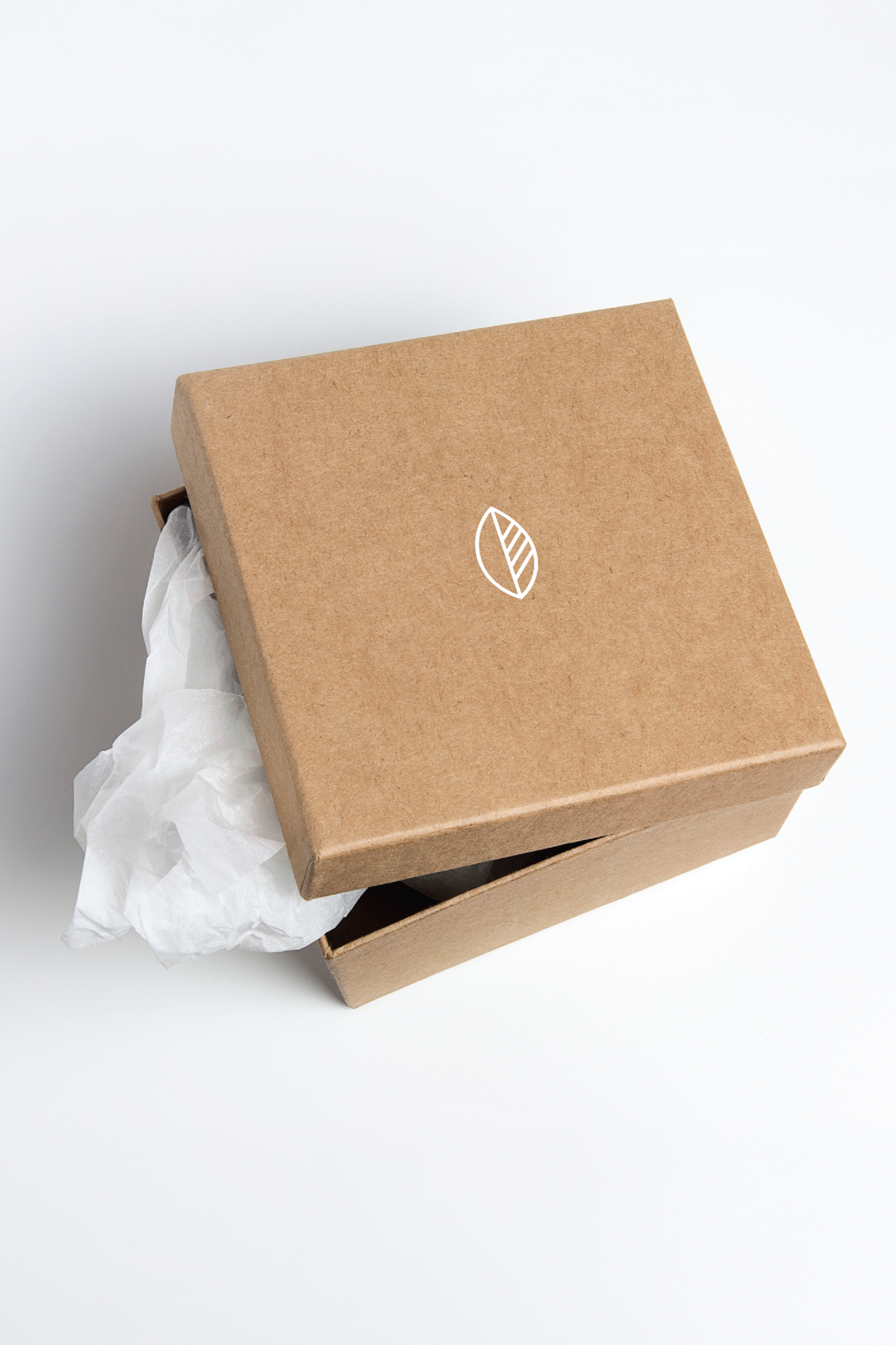
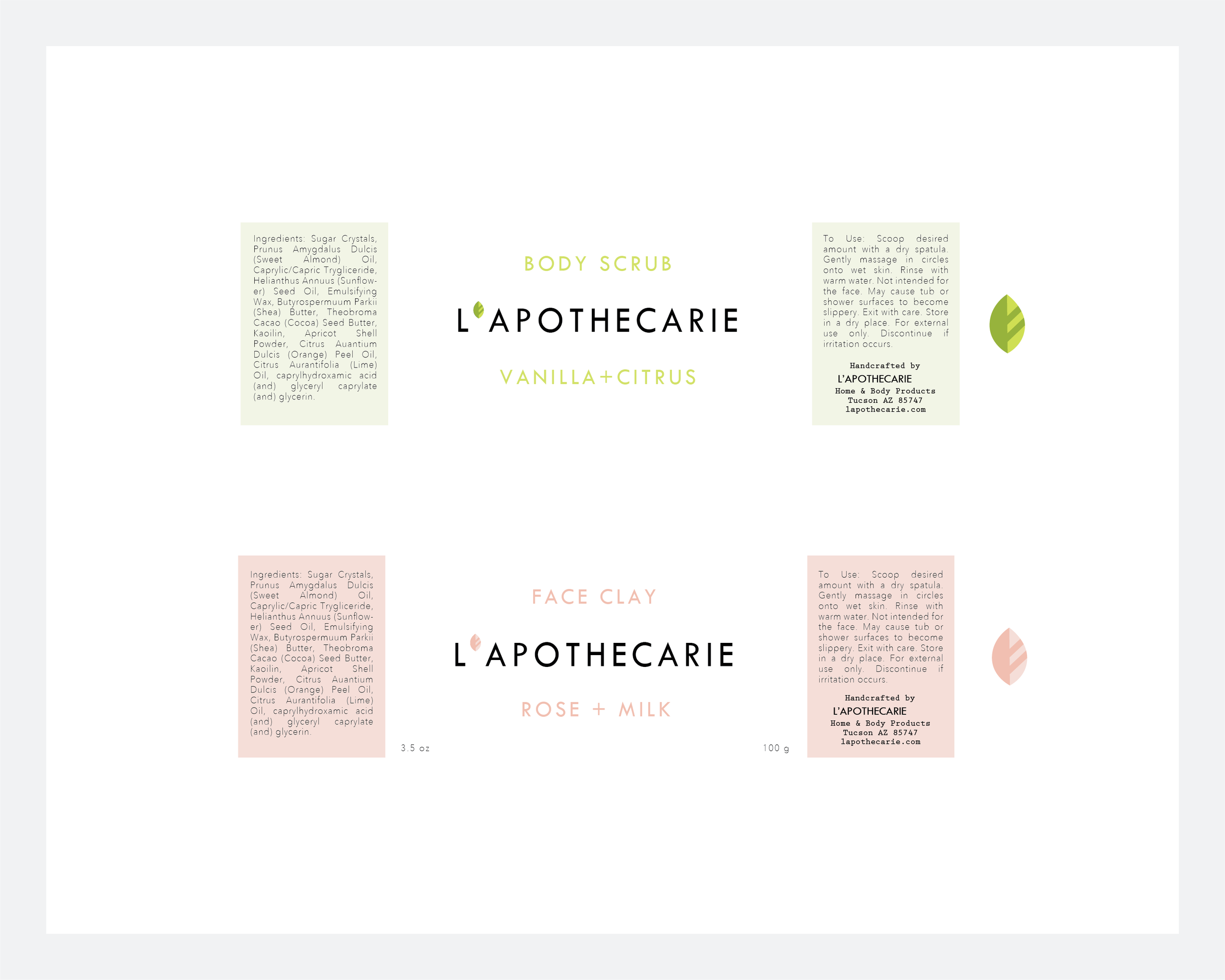
L’apothecarie is a small-batch skincare brand specializing in natural ingredients and sustainable practices. The owner requested an update to the company logo, logotype, and packaging — specifically modernized to communicate luxury and cleanliness.
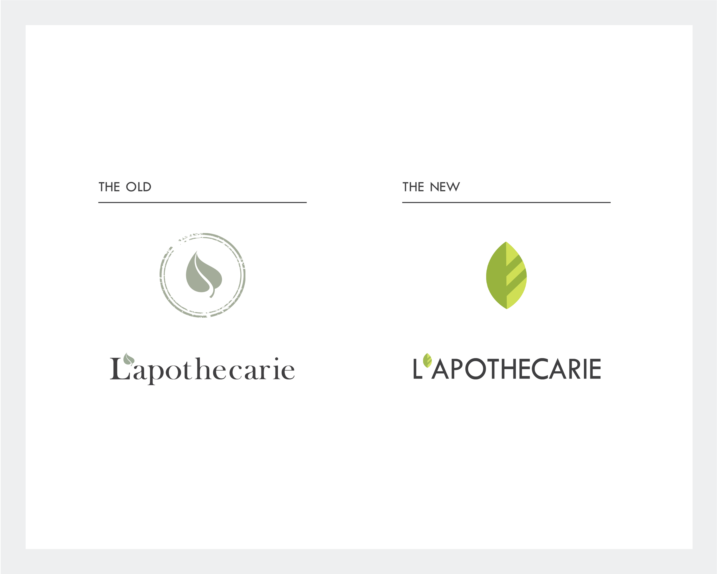
The original design was romantic, organic, rustic, and muted. The leaf motif is a beautiful and effective symbol for natural ingredients and sustainability, and was retained in the brand redesign.
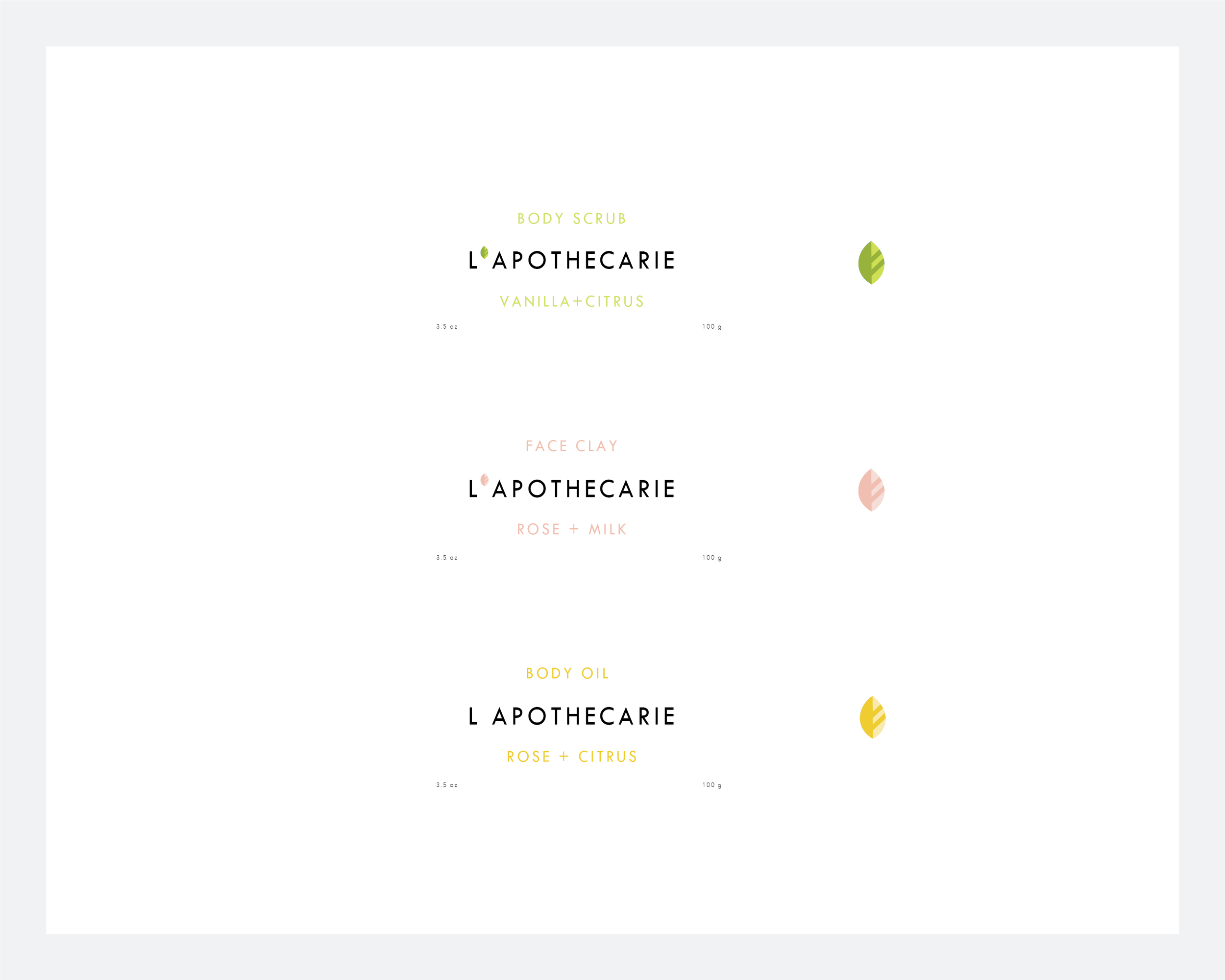
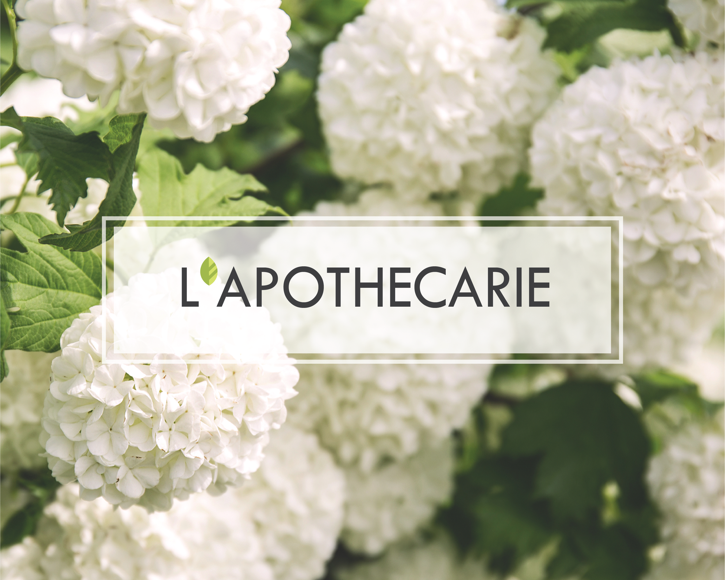
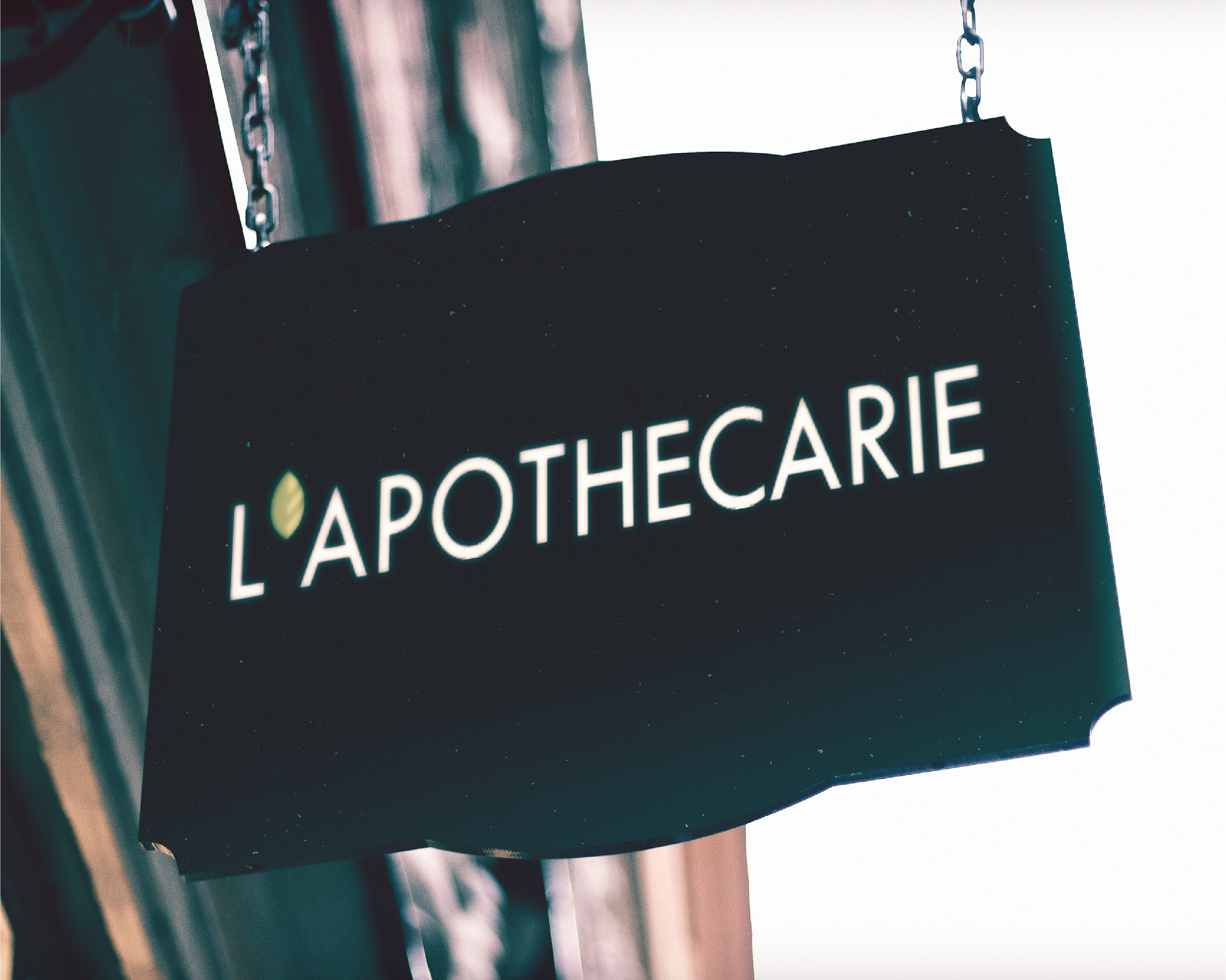
To update the brand to fit the company’s desired tone, I modernized the logotype with a sans serif typeface, simplified the logo using clean geometric forms, and freshened both by exchanging the original dry sage green for a brighter, fresher hue resembling new leaves and fresh sprouts.
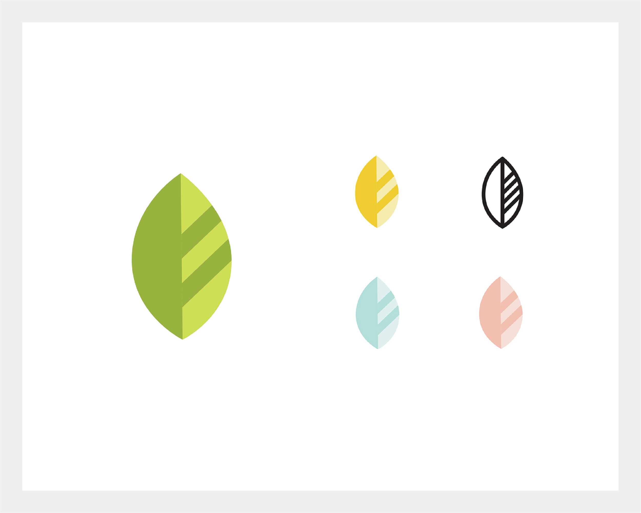
The iconic new logo and minimal color palette allows for plenty of creative flexibility.