
Mason Immigration Law
UX Audit & Redesign
Intro Spiel
Hey there! If you prefer to read the video transcripts, you may do so on YouTube by clicking here.
You can also look at slides from a more extensive presentation here.
Executive Summary
A summary of the project focusing on the design and research process as well as comparing redesign “before” and “after”s. Click any of the timestamps below to view on Youtube.
00:00 Intro
00:49 Double Diamond Model
02:03 UX Audit
02:25 Interview
03:45 Heuristic Evaluation
04:15 Survey
05:00 Usability Testing
05:33 Personas
06:40 User Journey Mapping
07:07 Site Redesign
07:29 Contact Page Prototype
09:42 Team Page Prototype
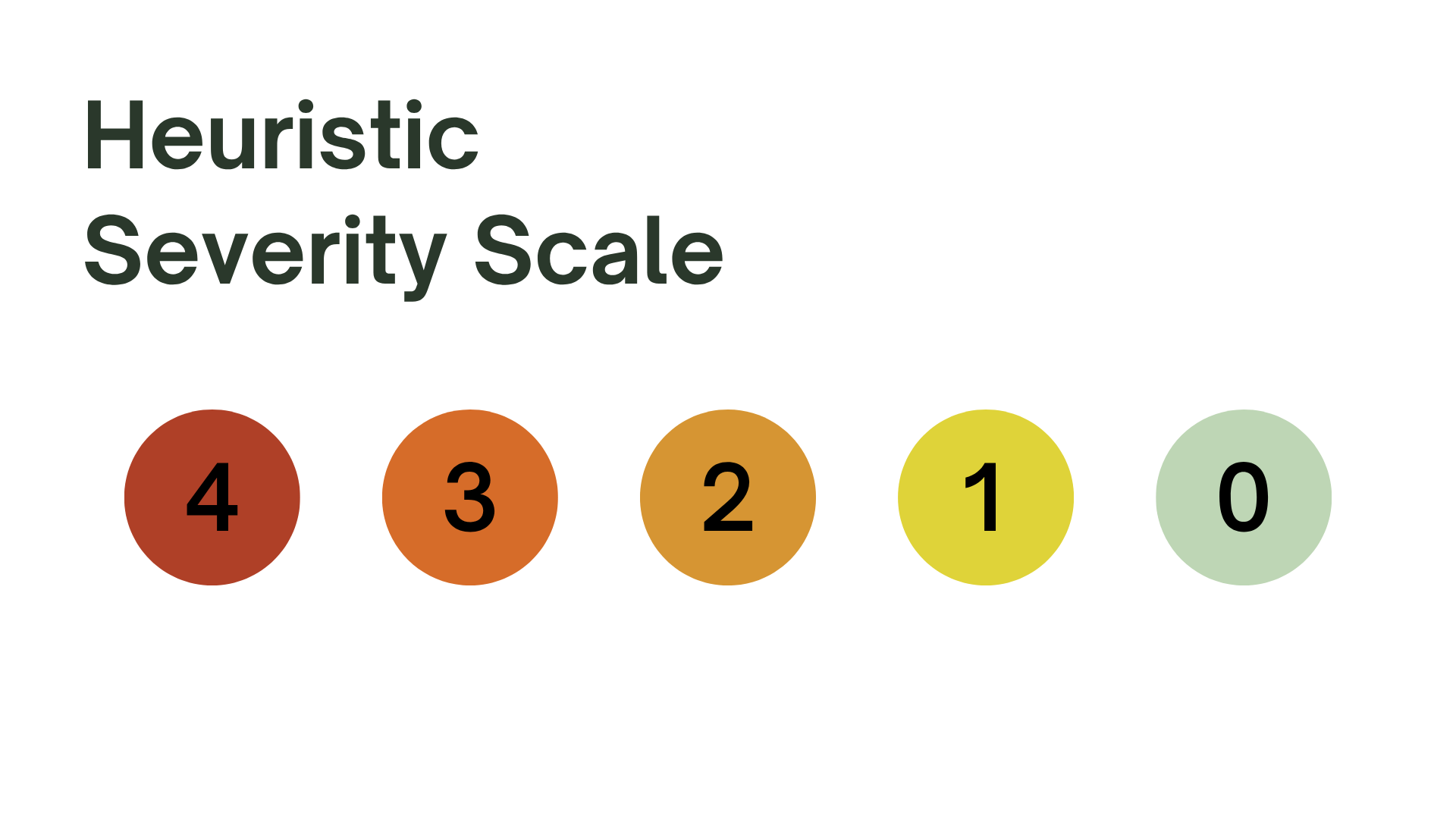
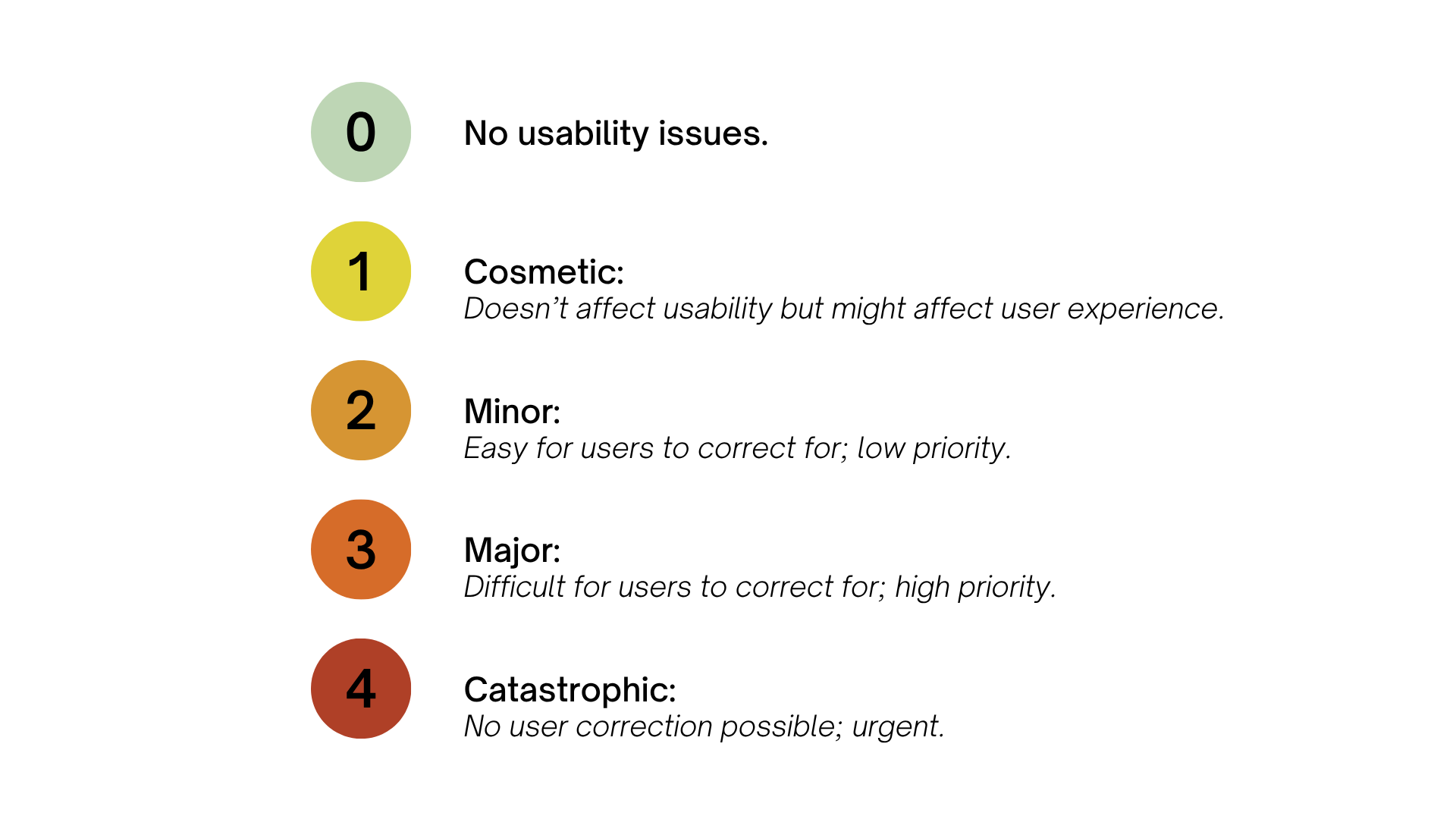
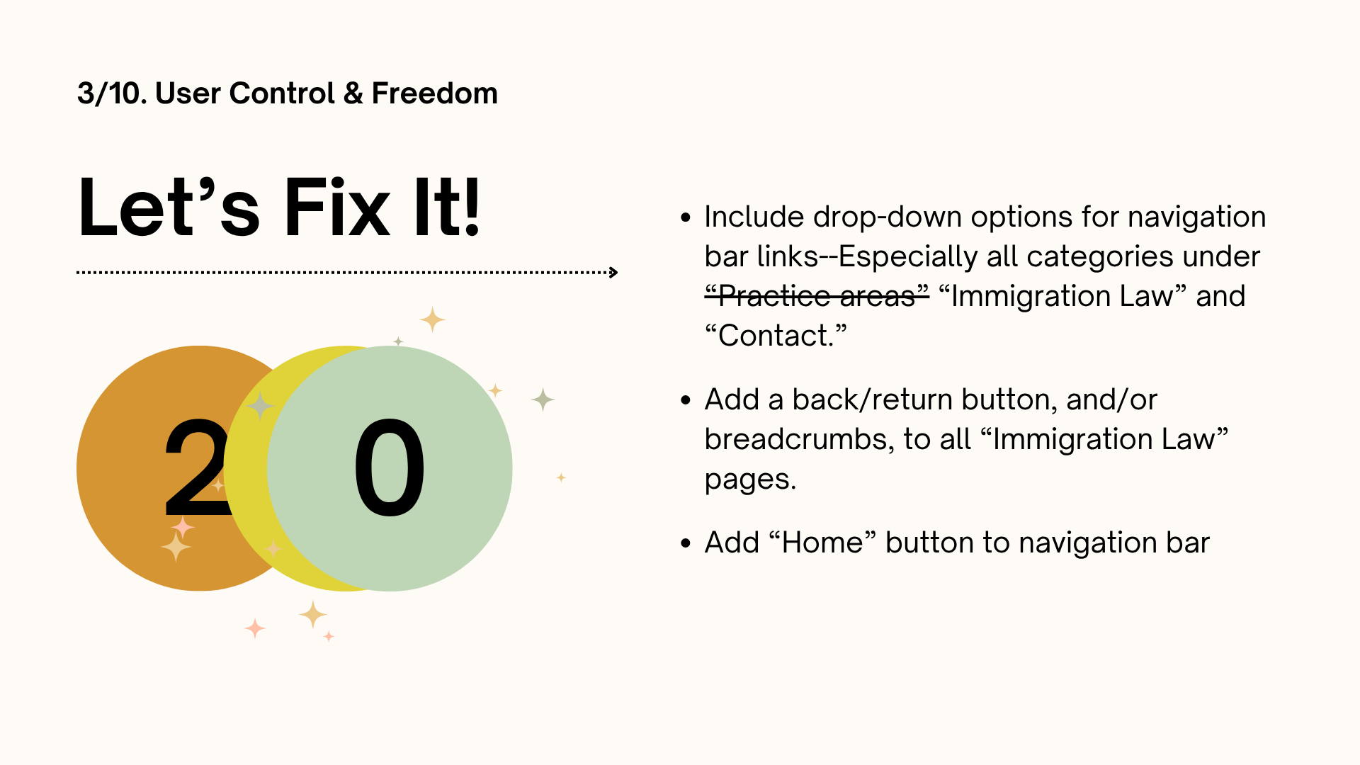
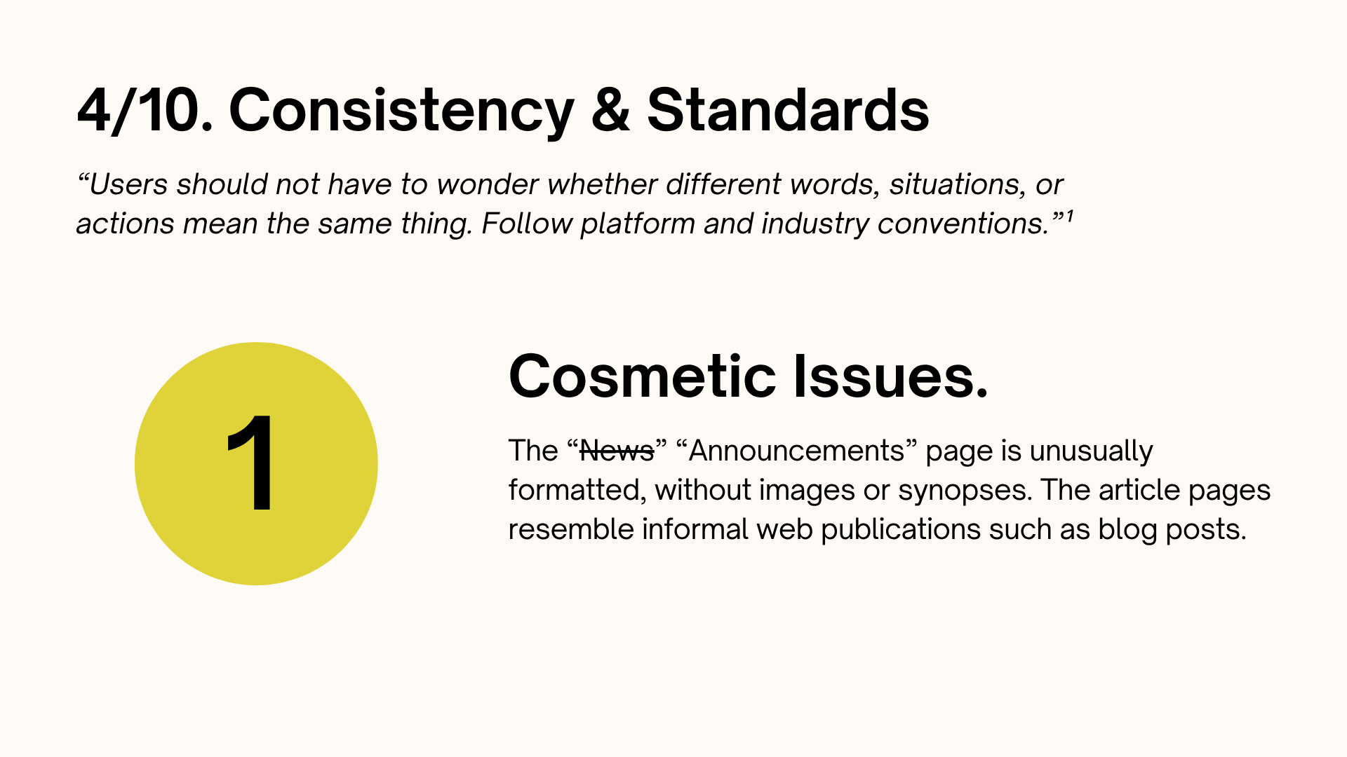
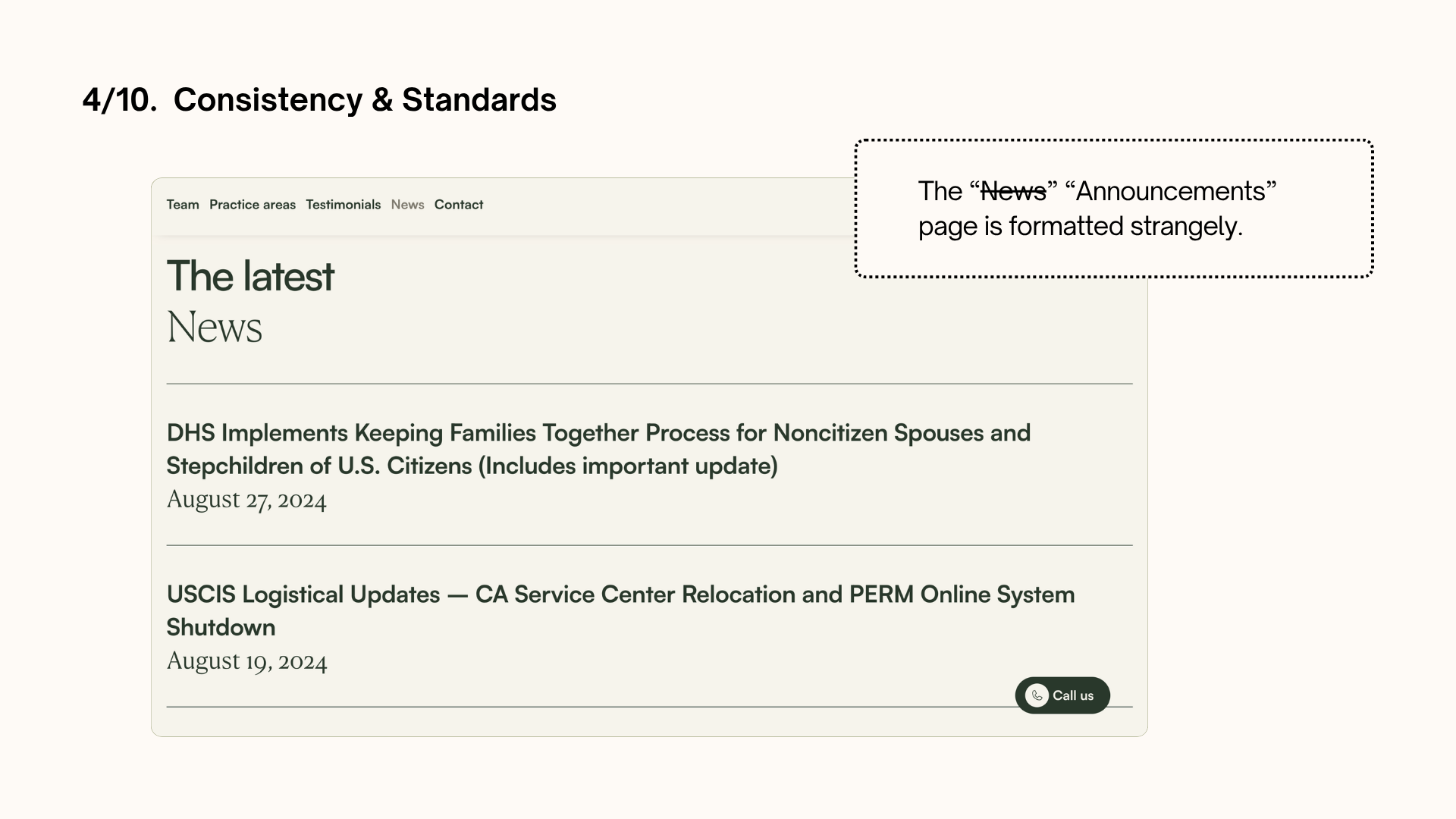
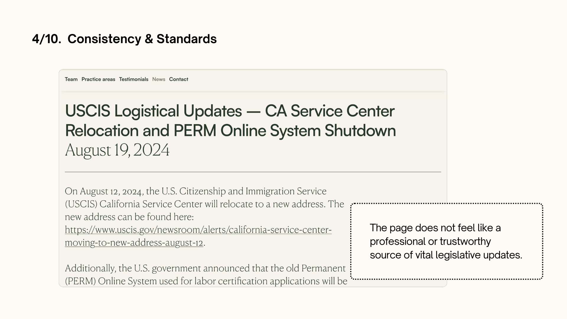
Heuristics
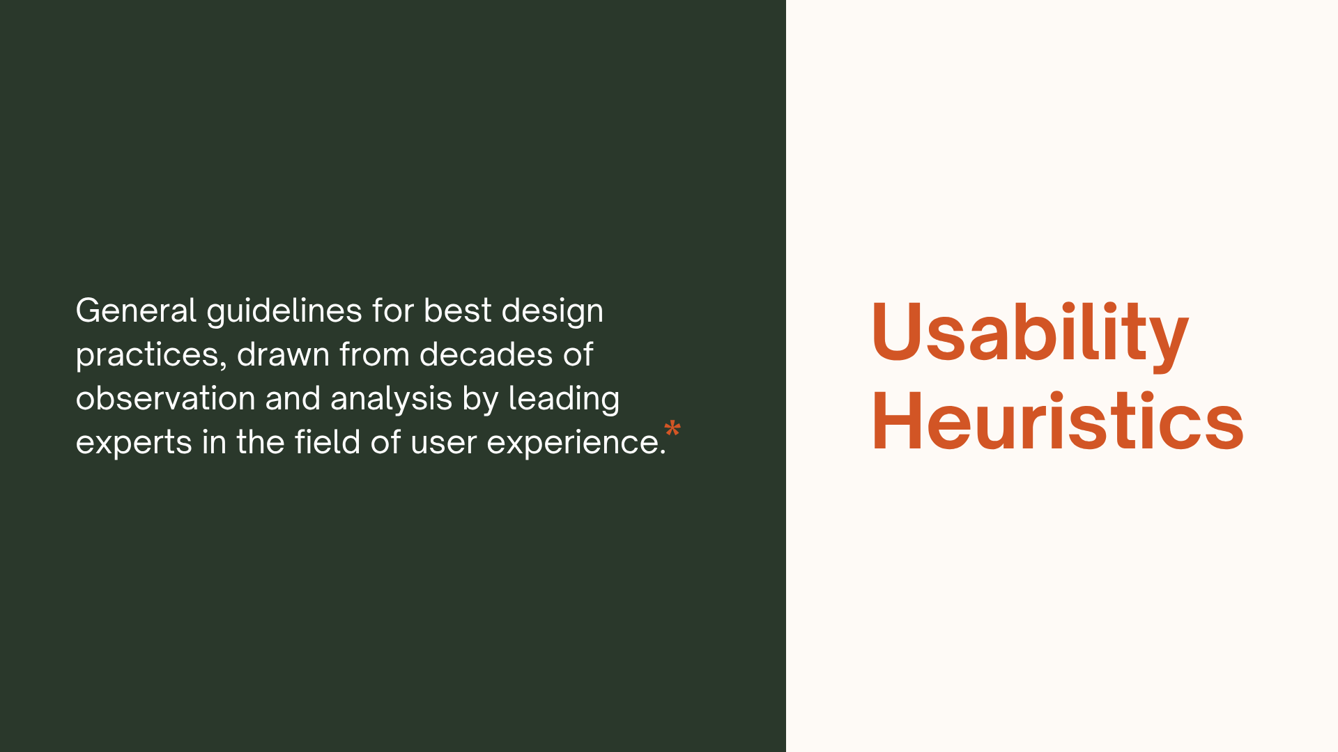
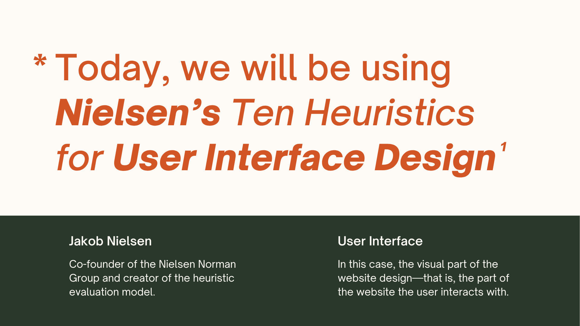
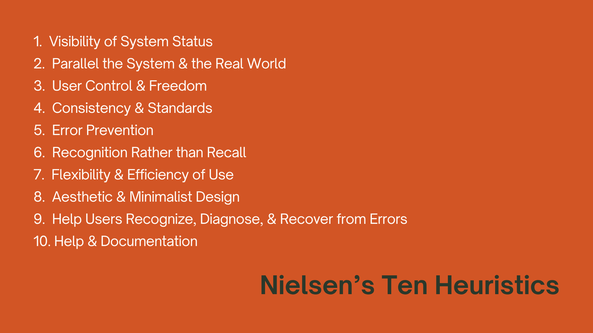
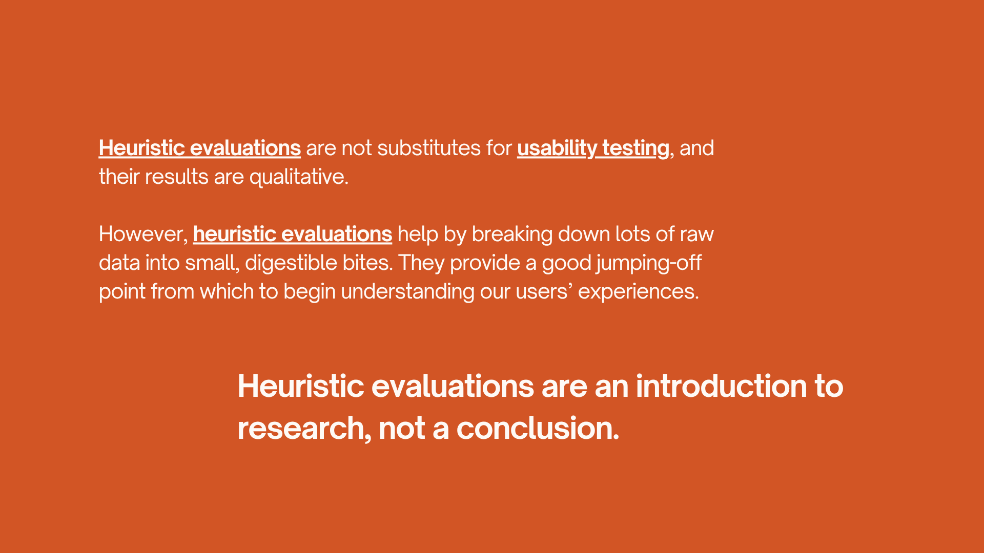
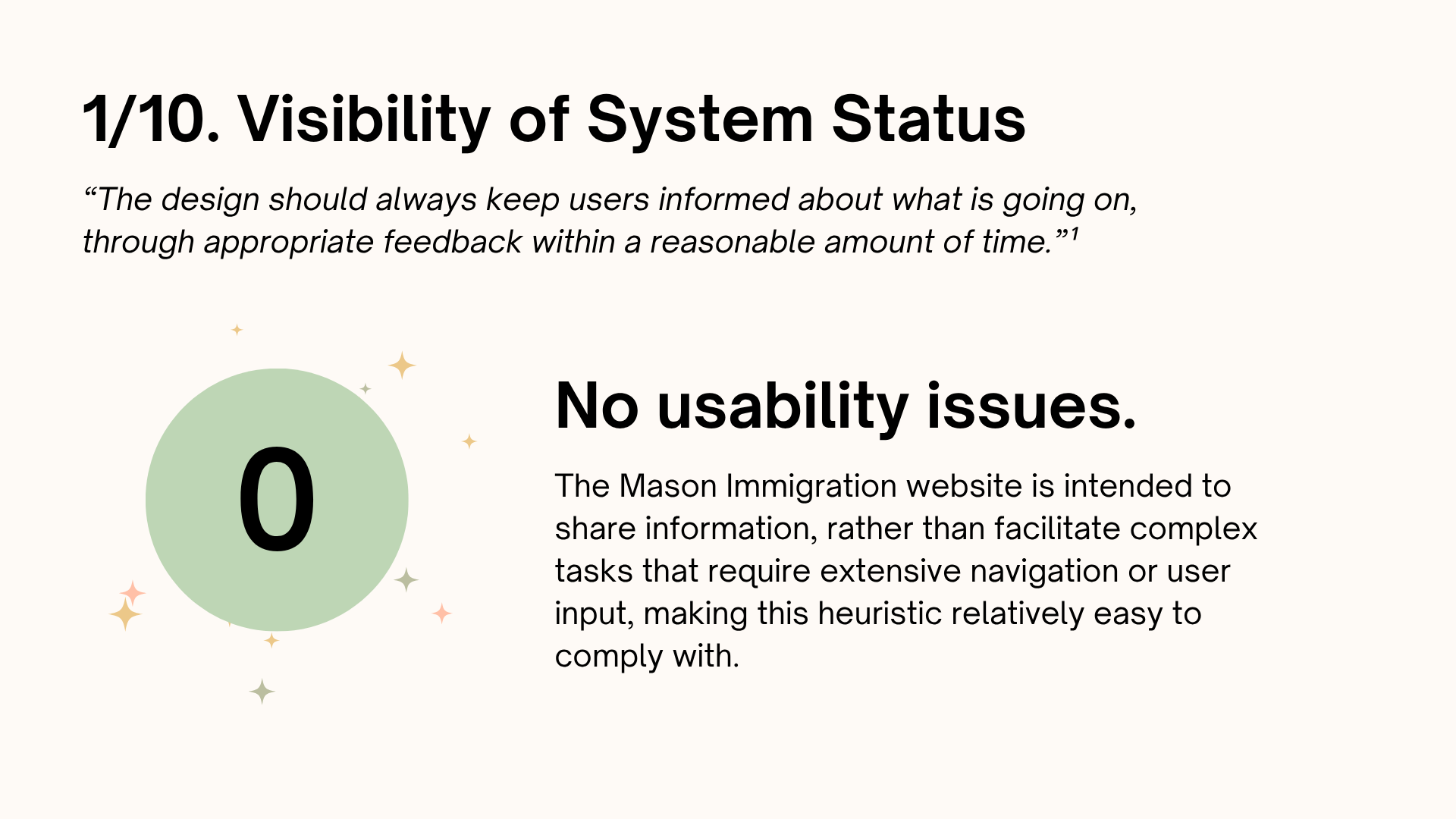
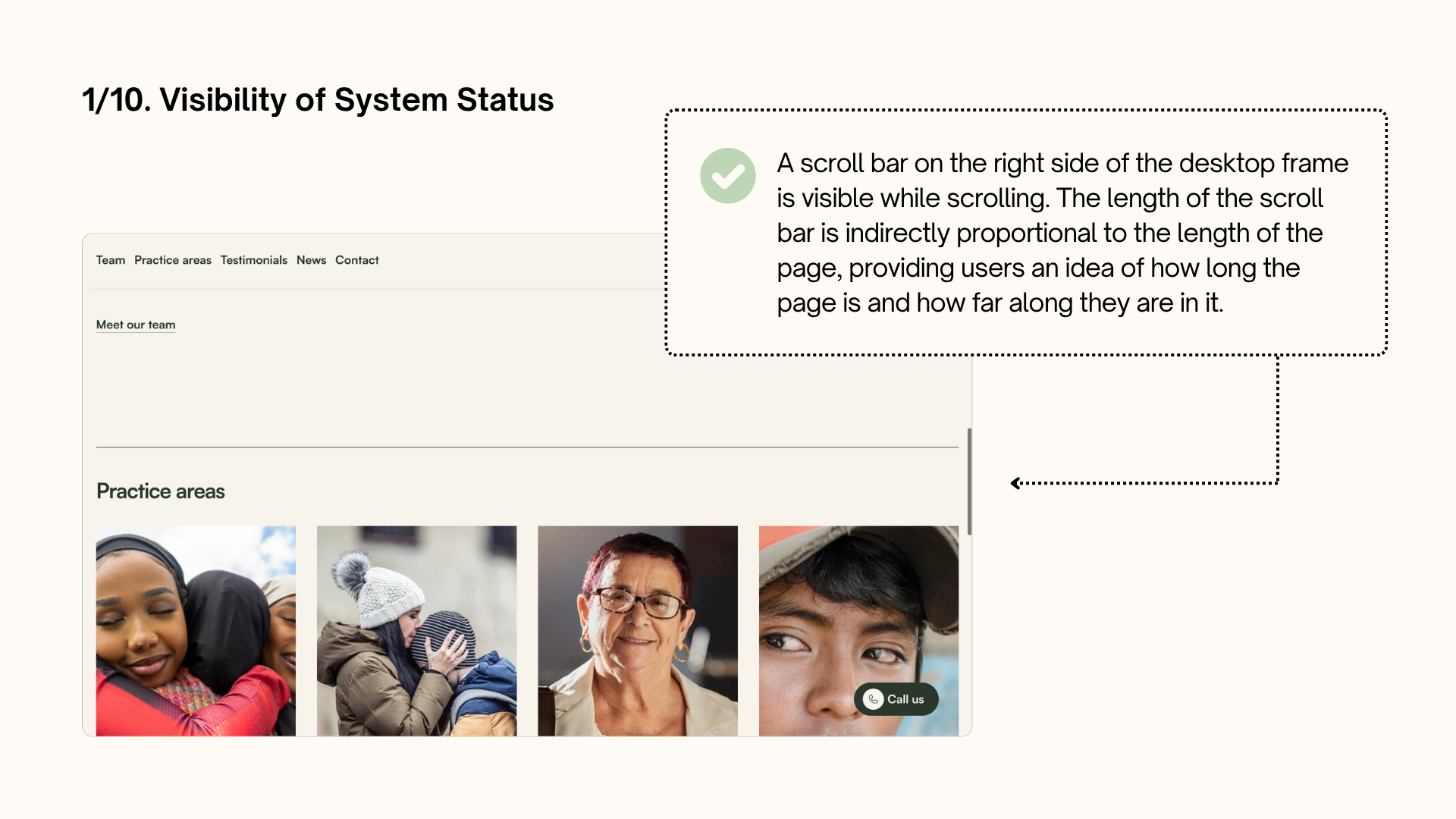
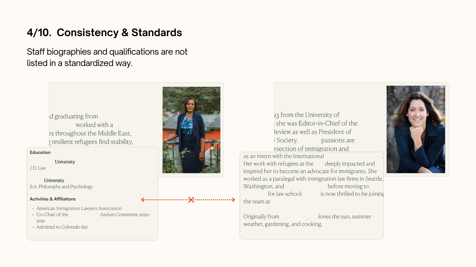
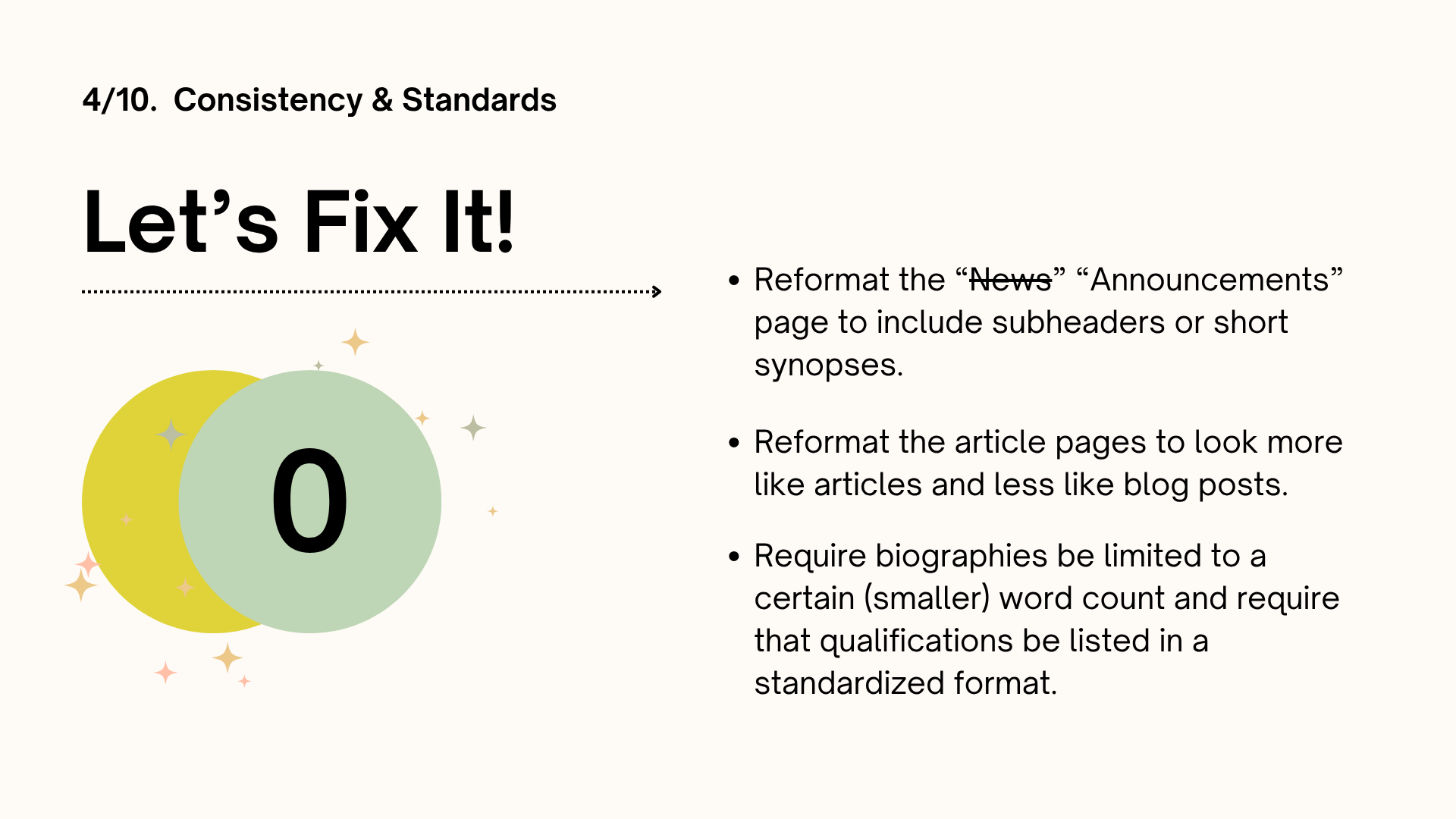
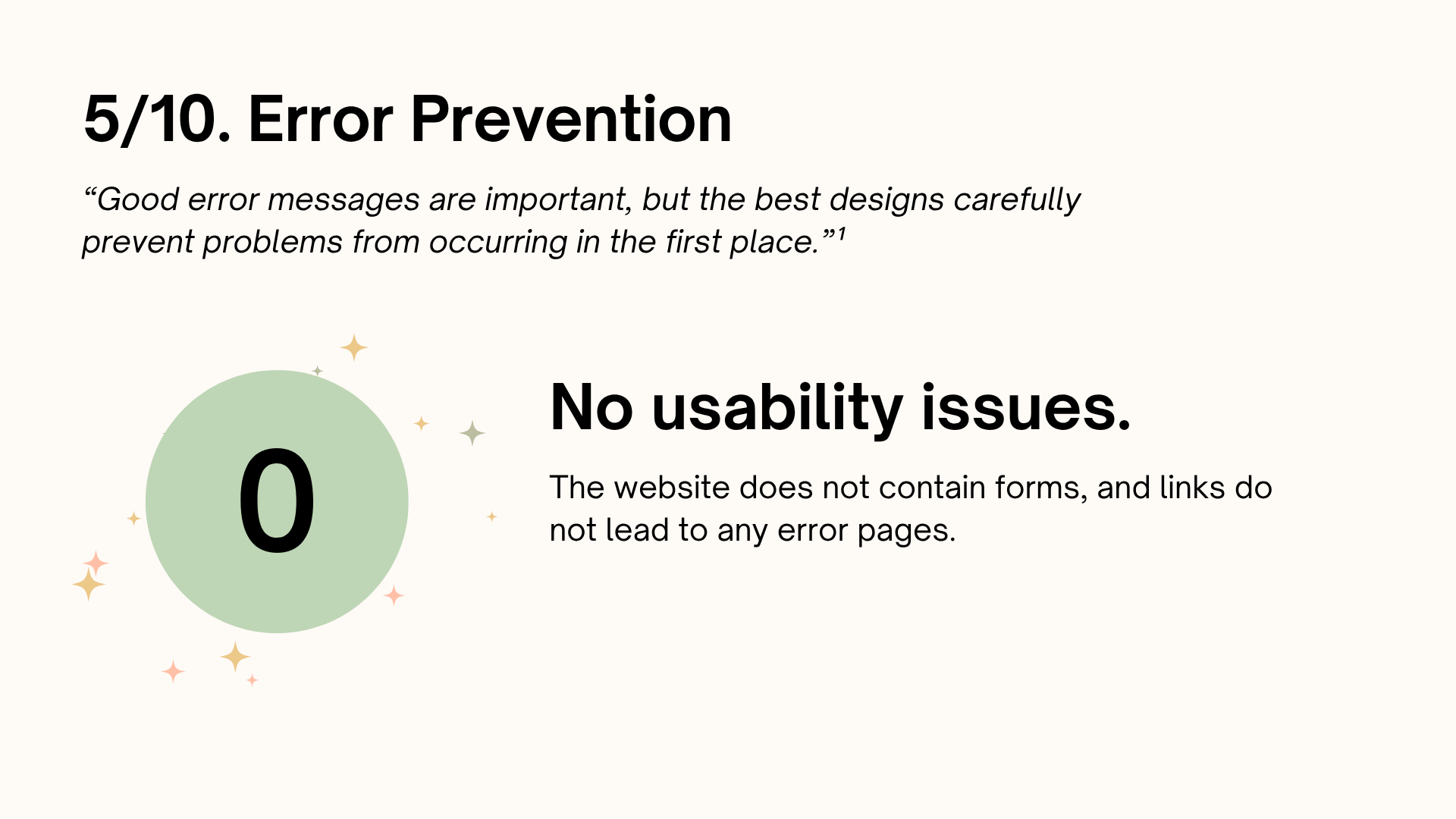
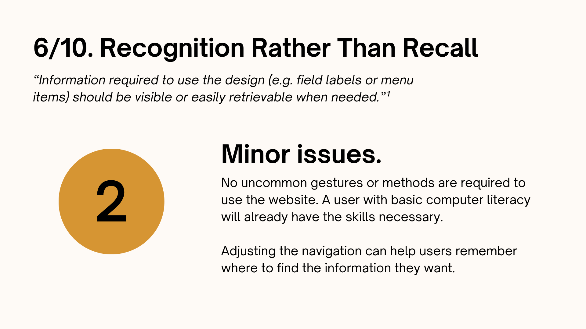
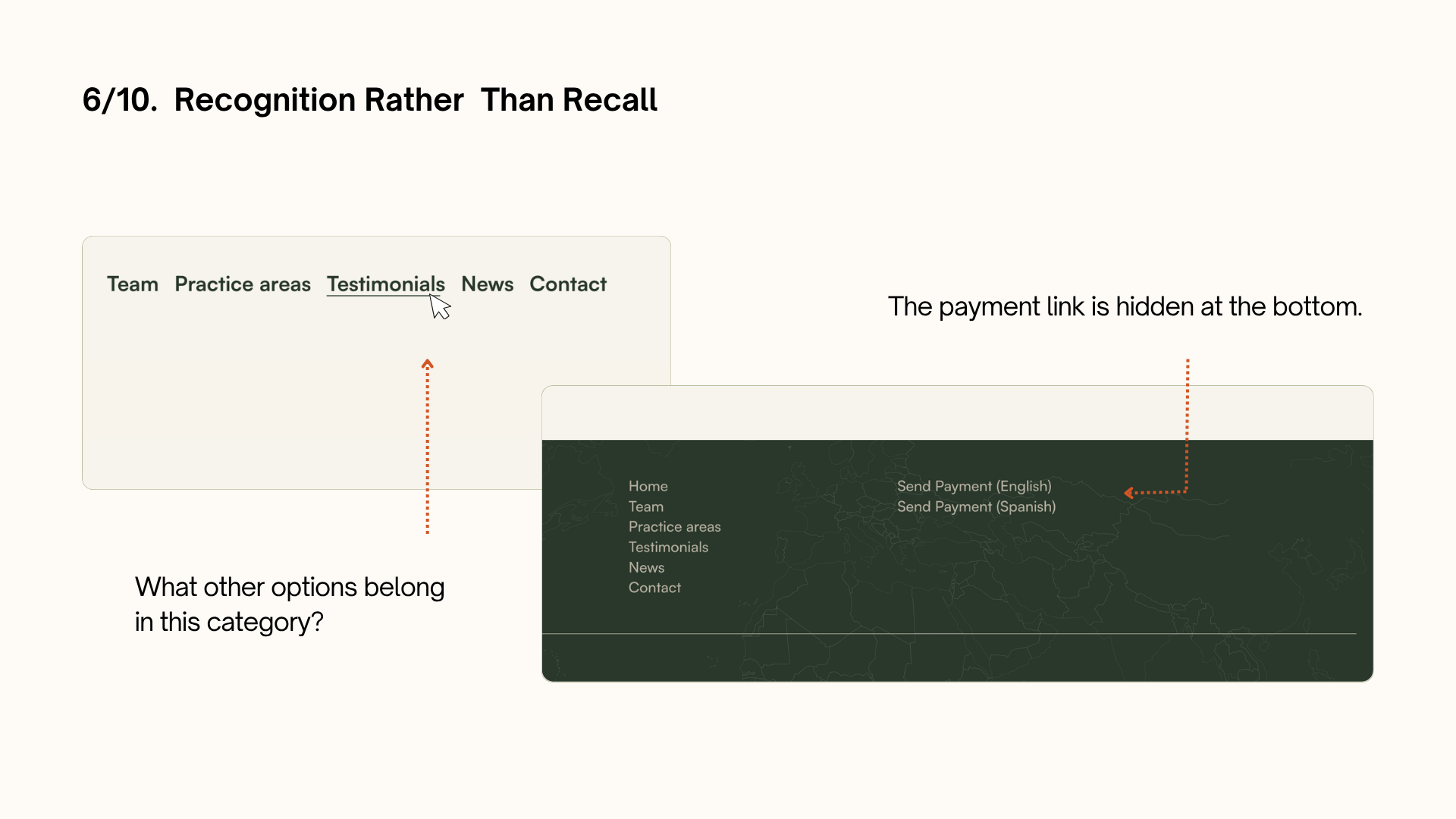
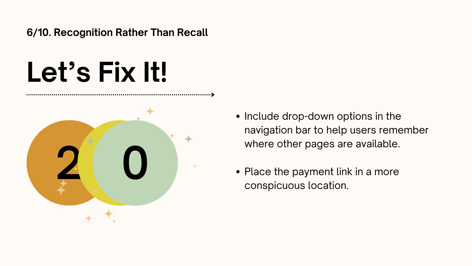
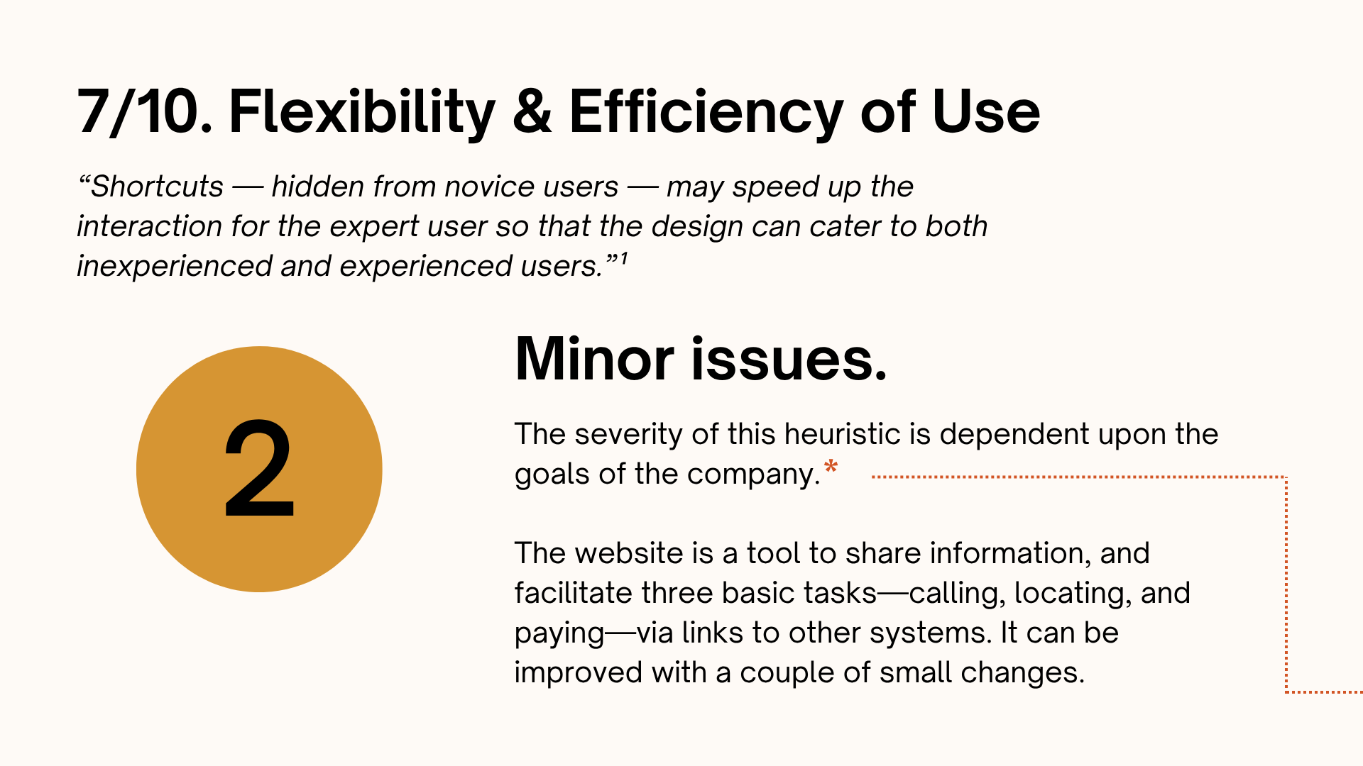
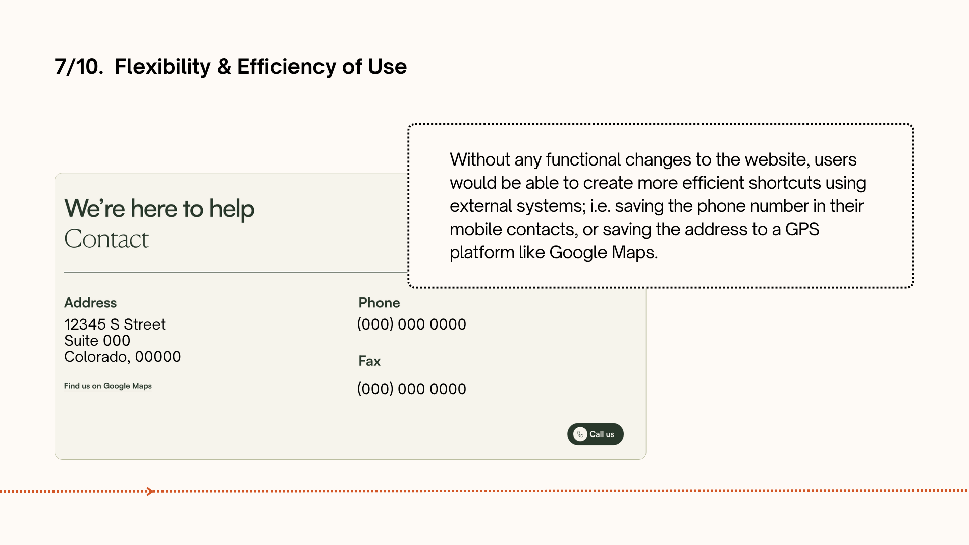
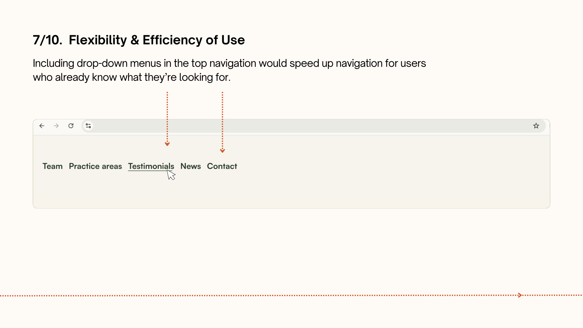
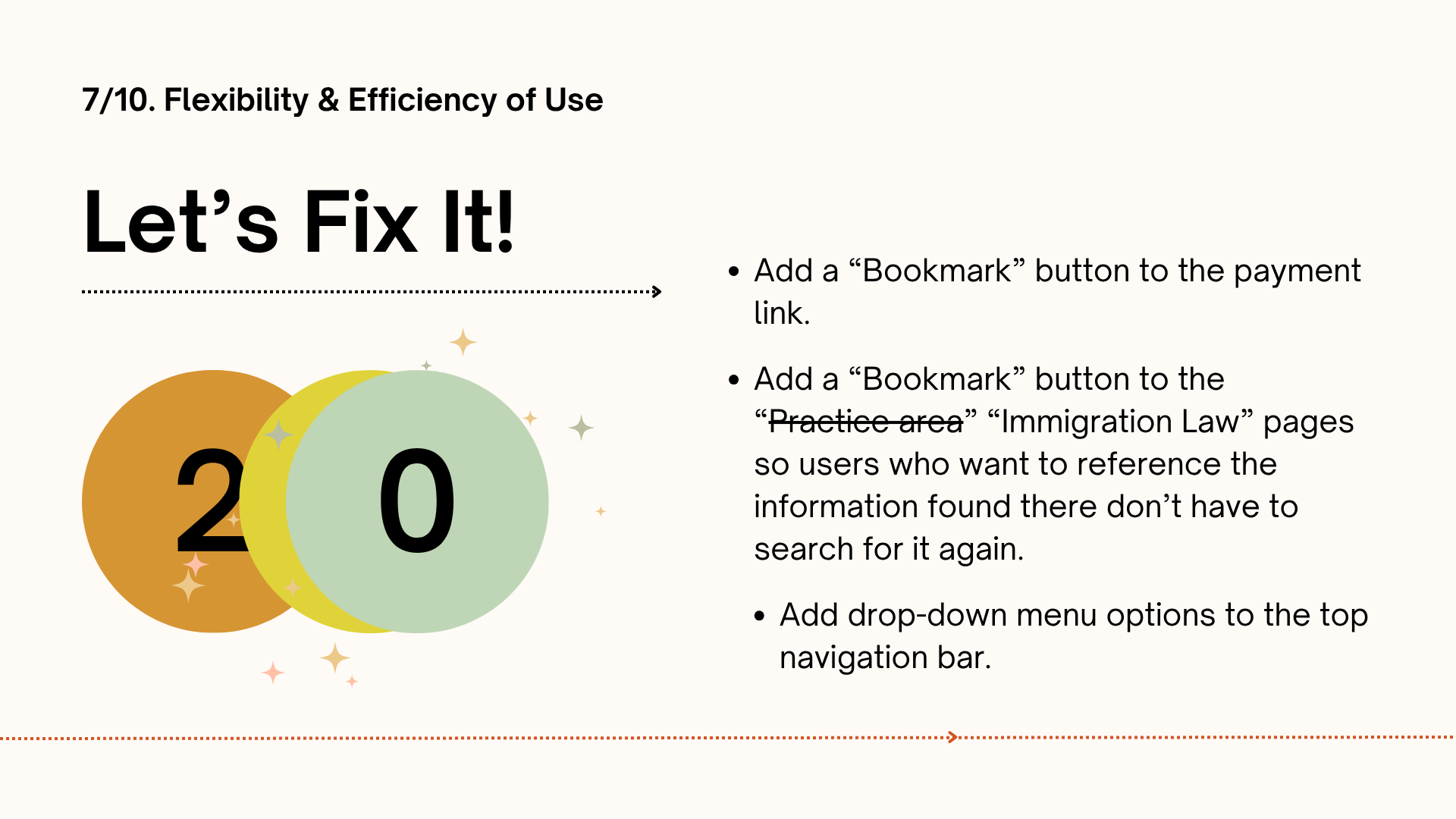
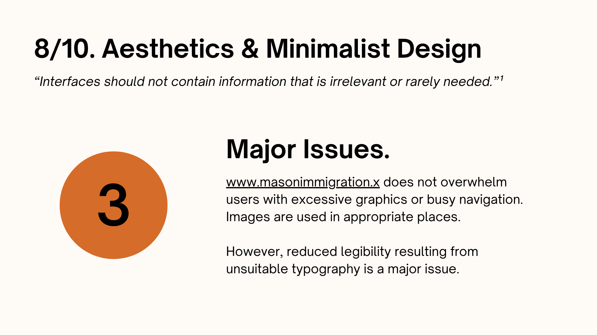
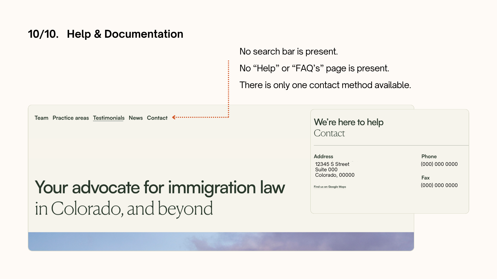
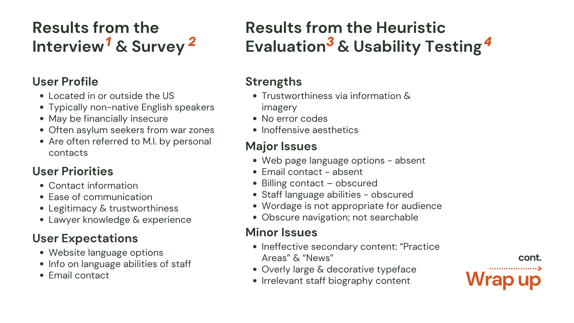
Heuristics, in the context of user experience and interaction design, are broadly accepted general rules based on previous research in the field, by which UX professionals can make early assessments about usability and accessibility.

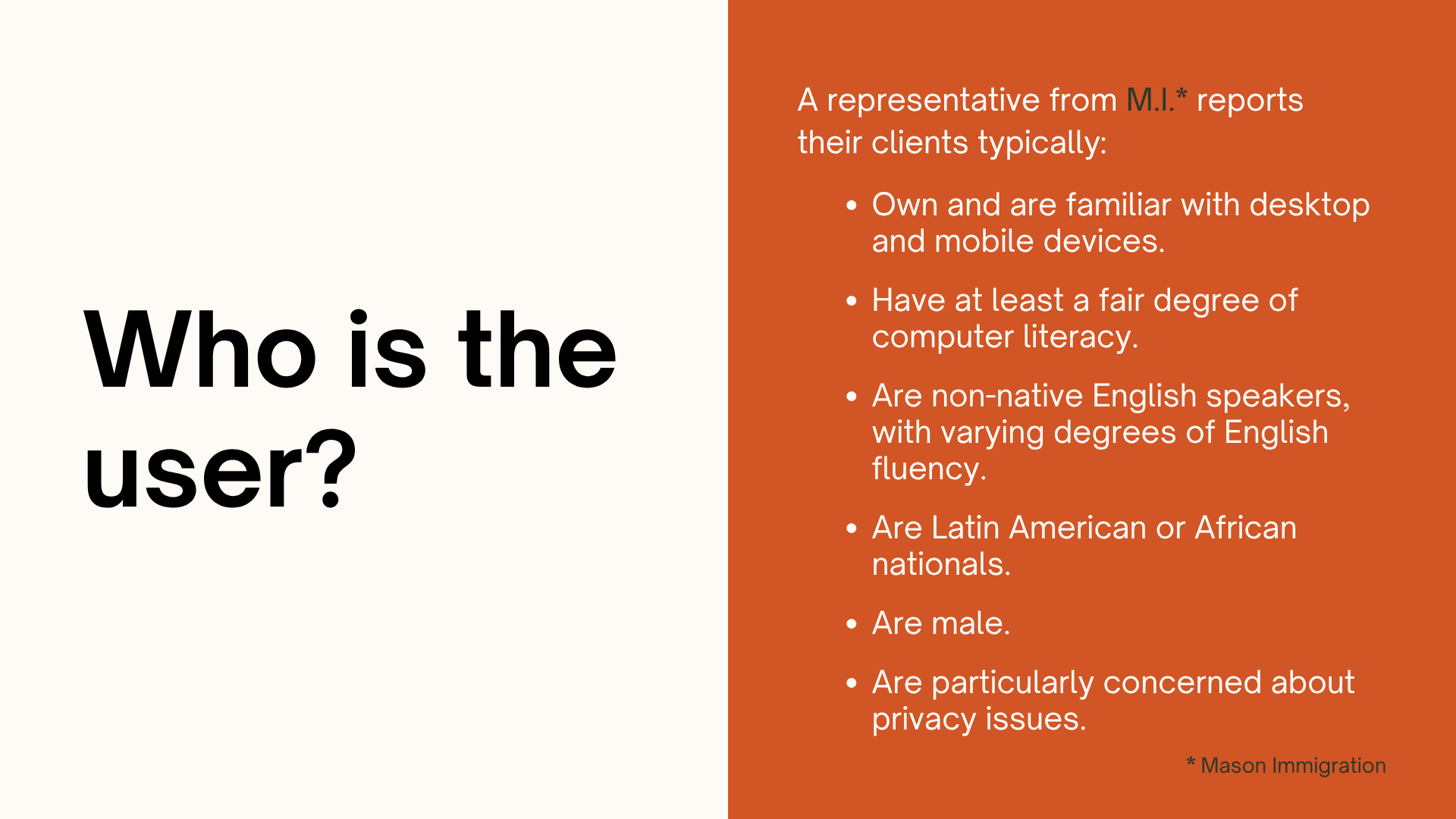
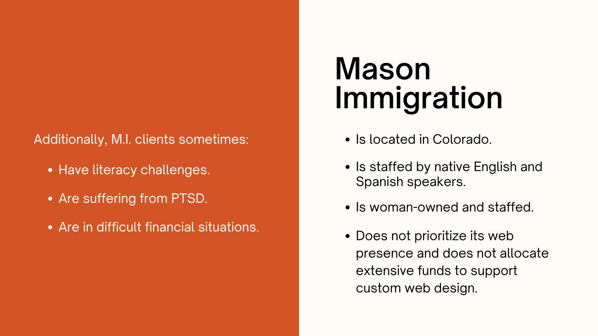
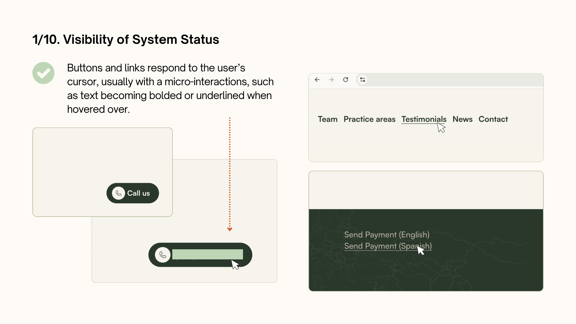
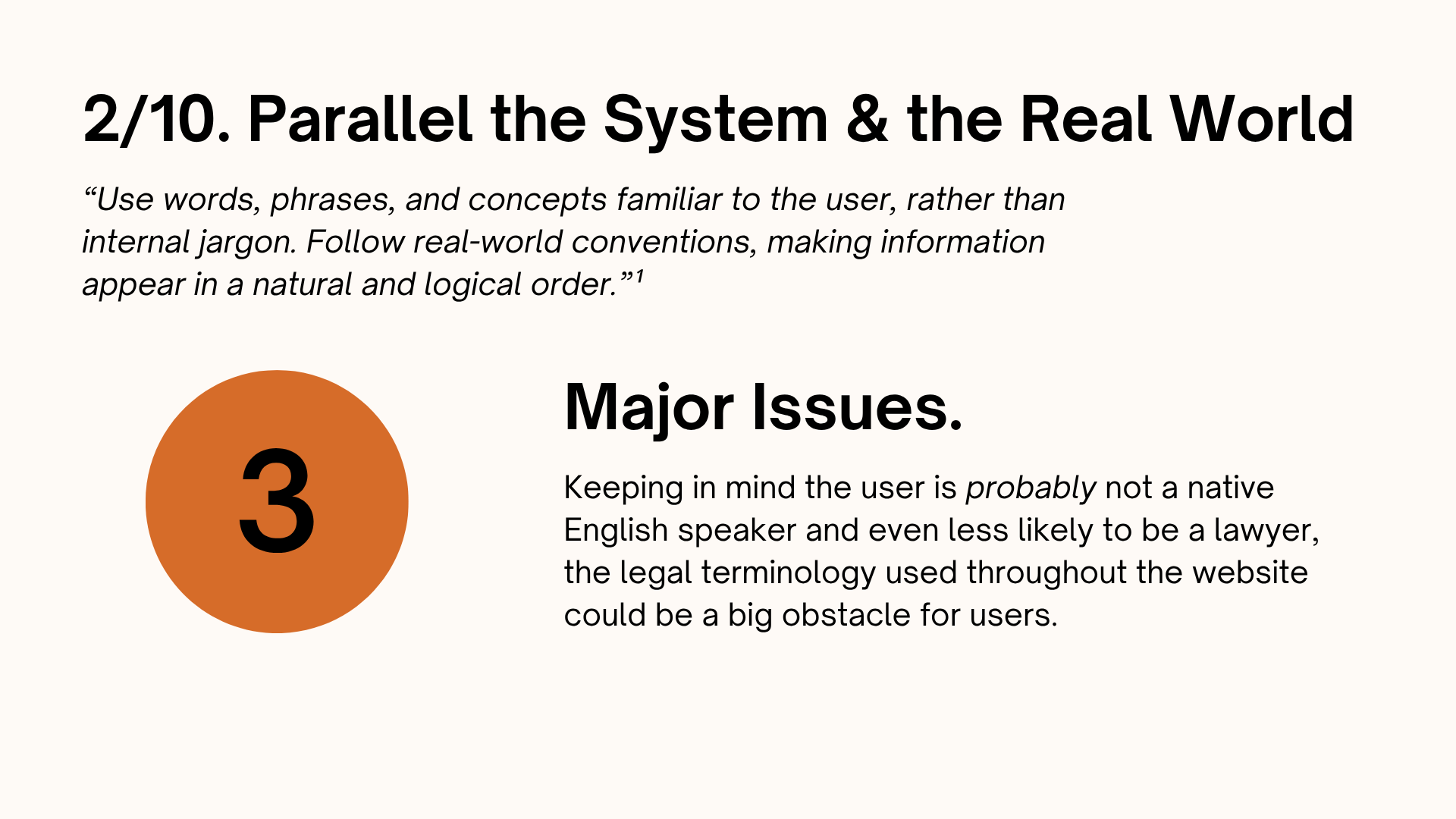
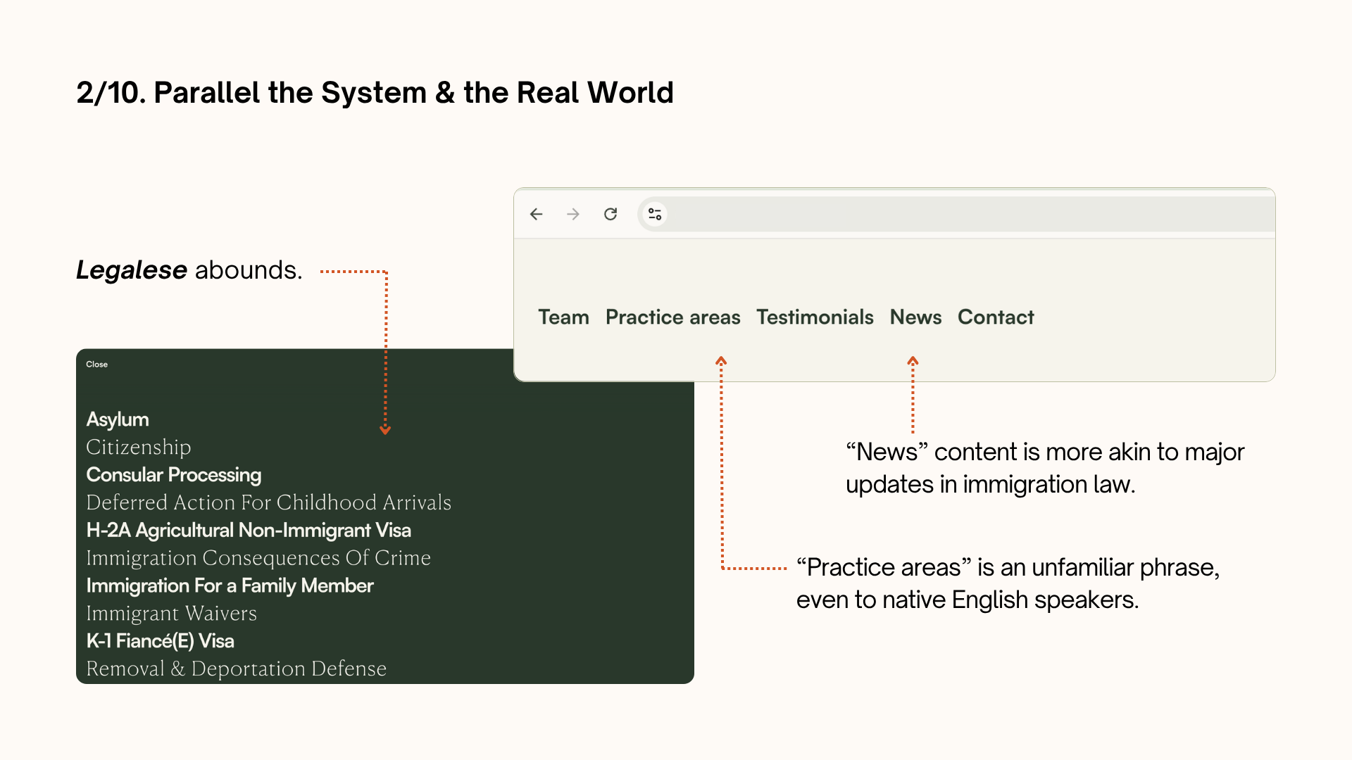
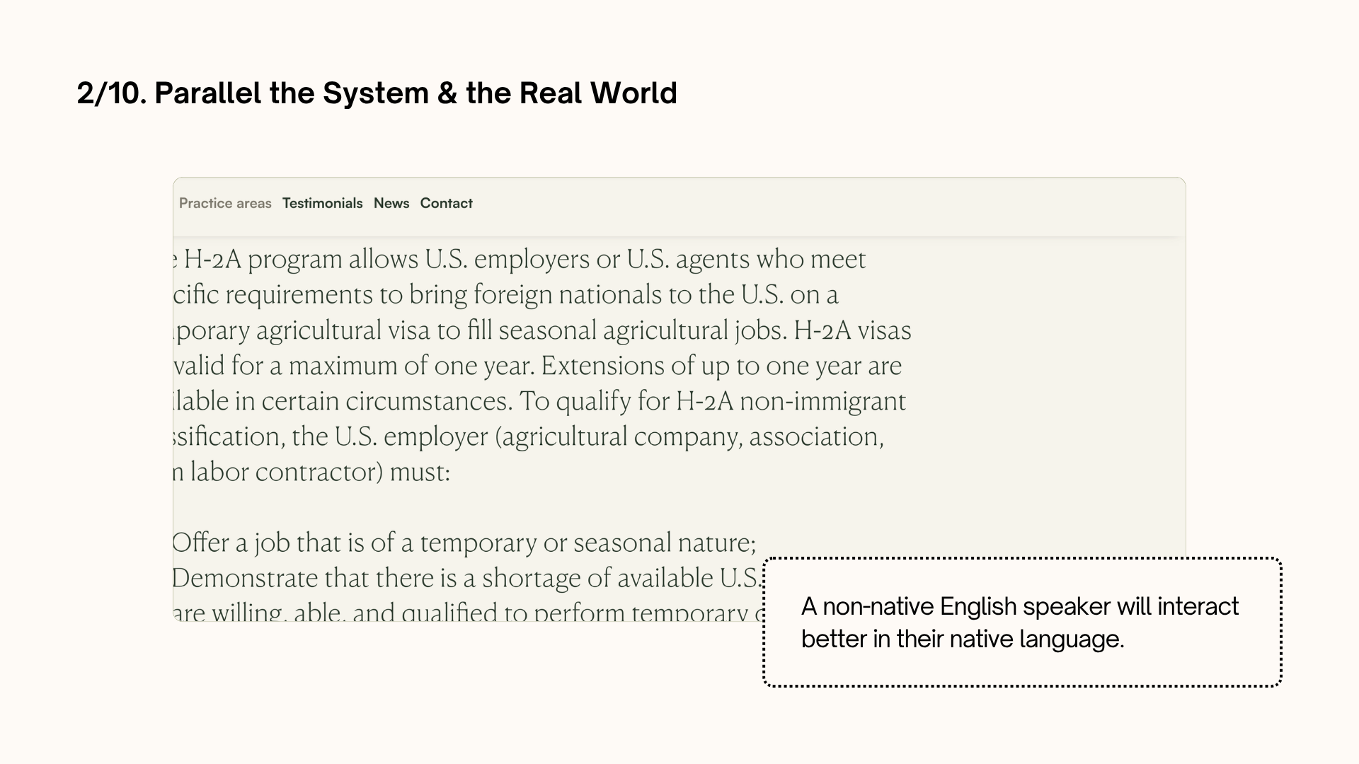
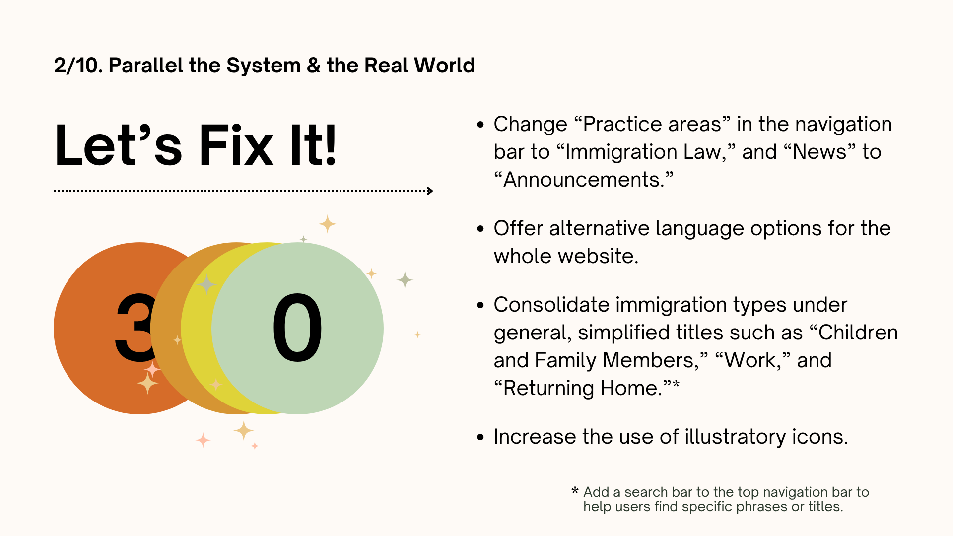
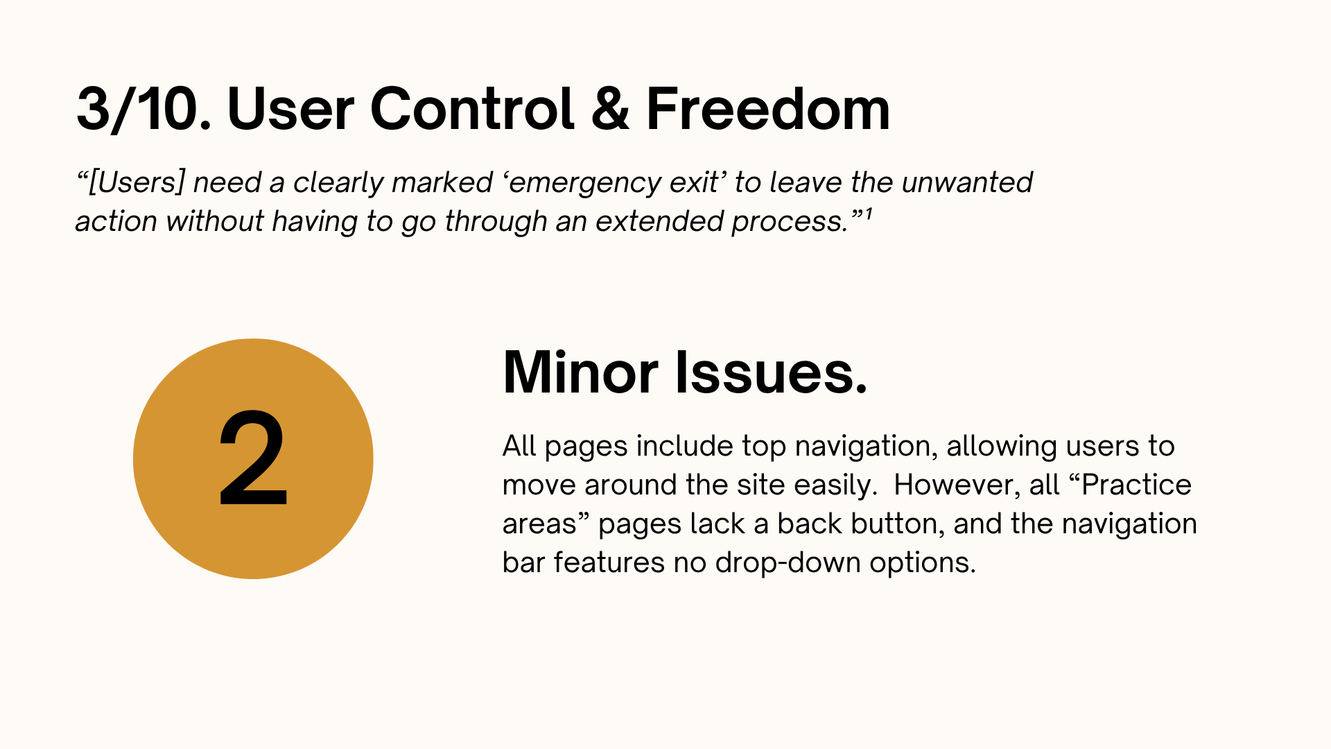
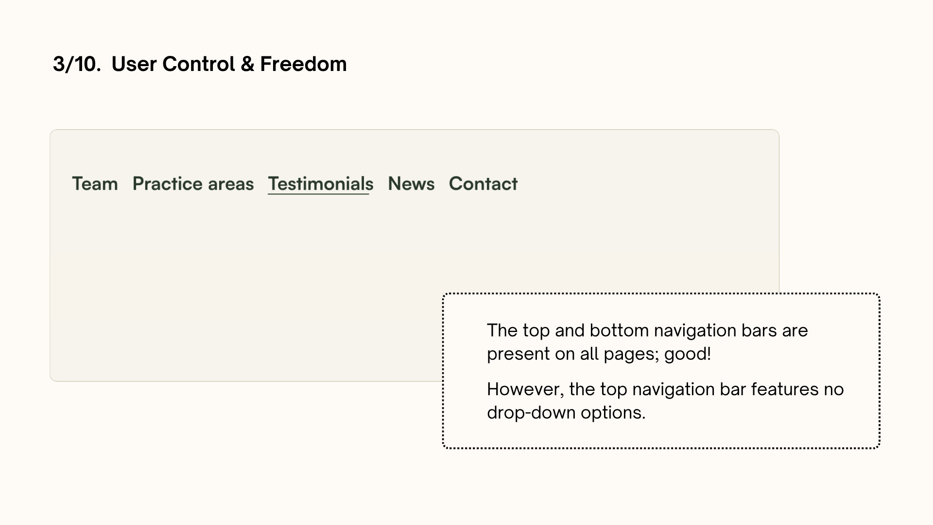
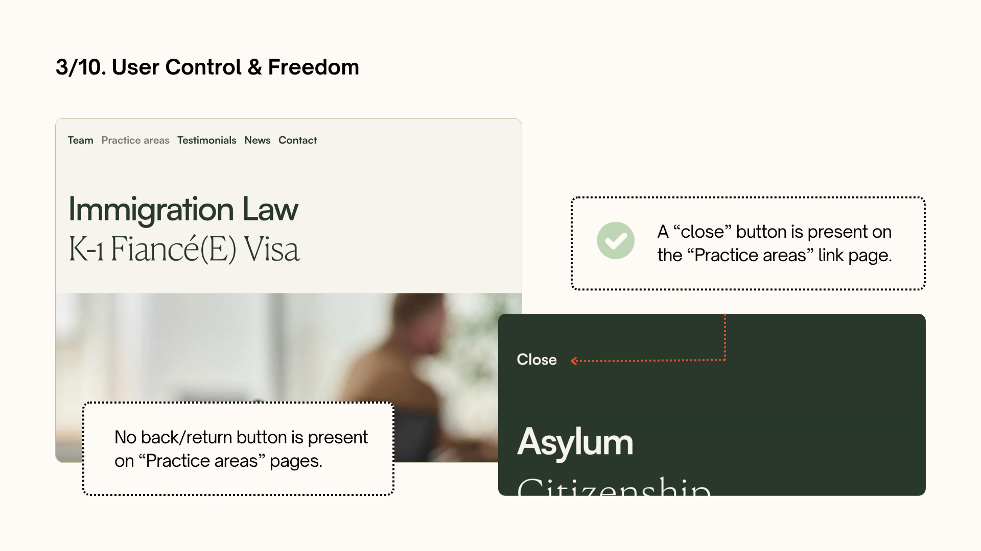
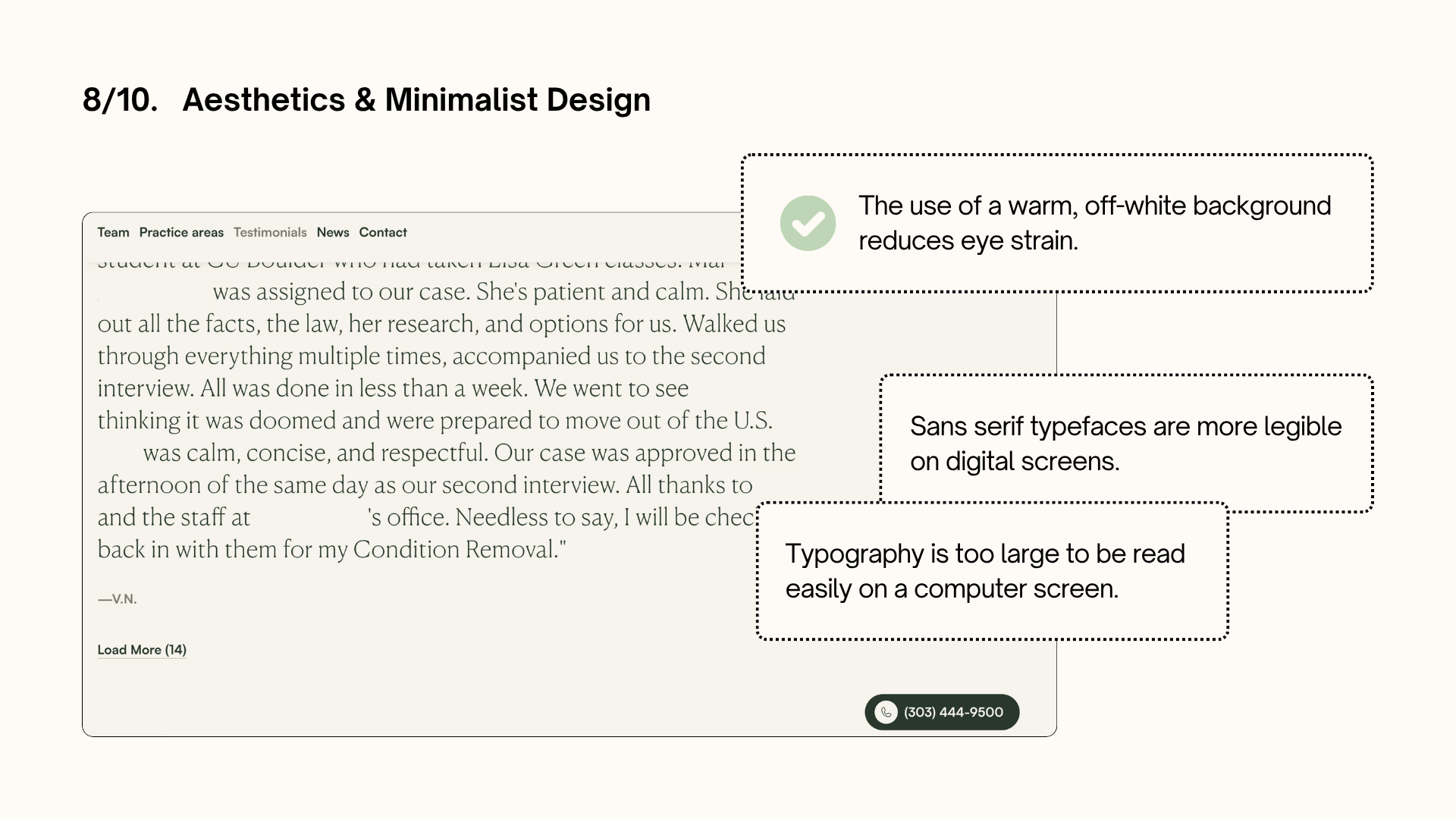
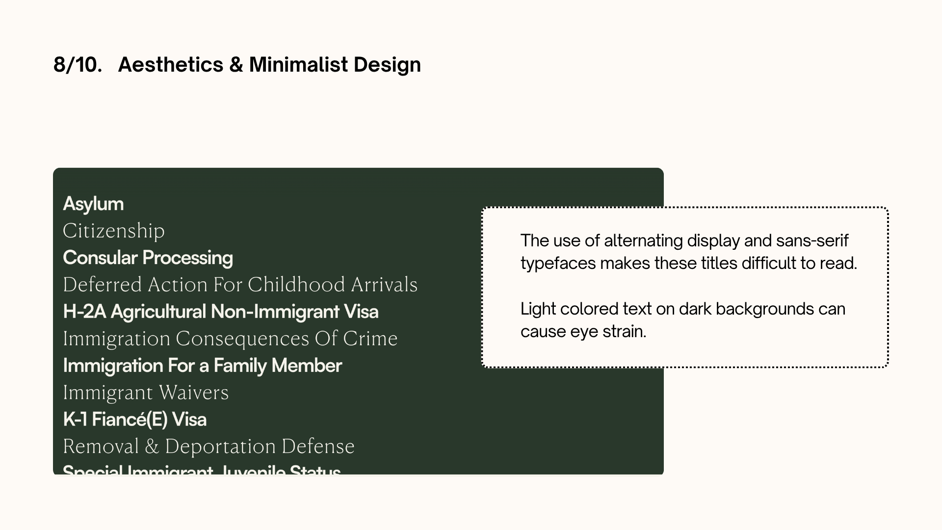
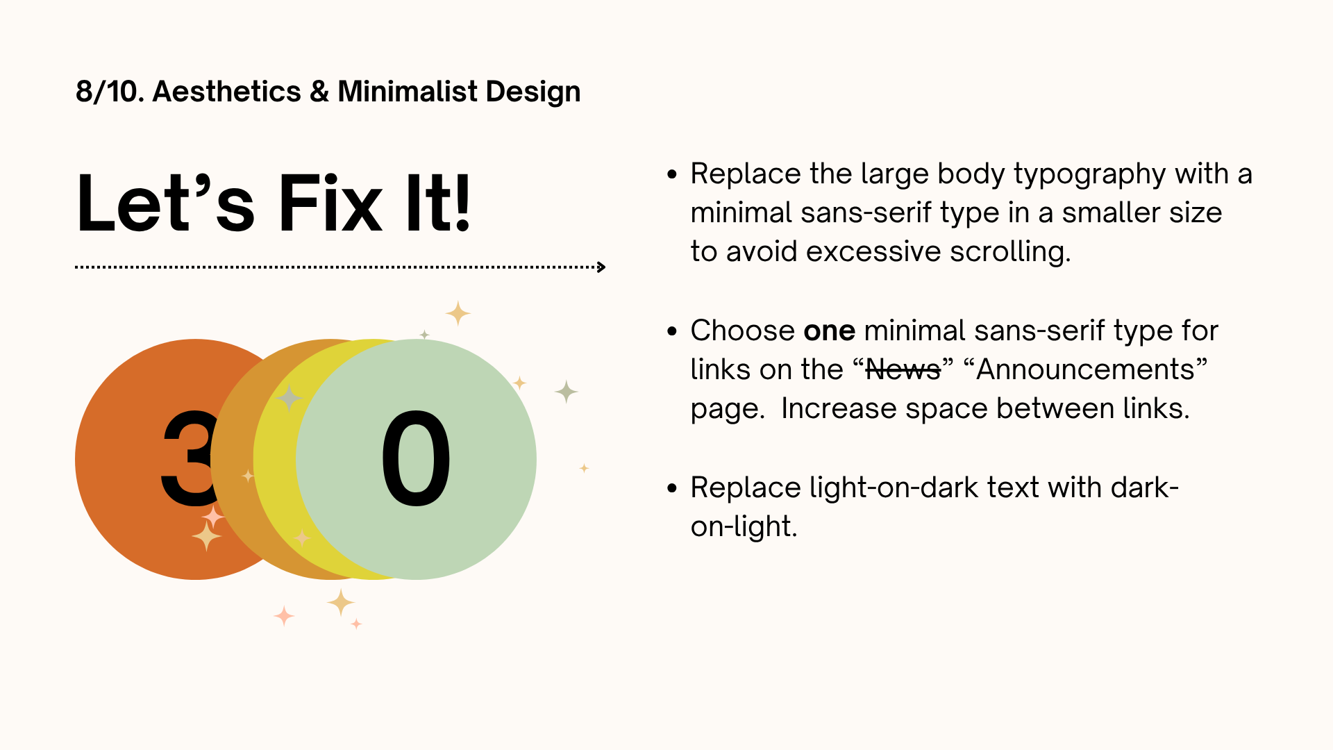
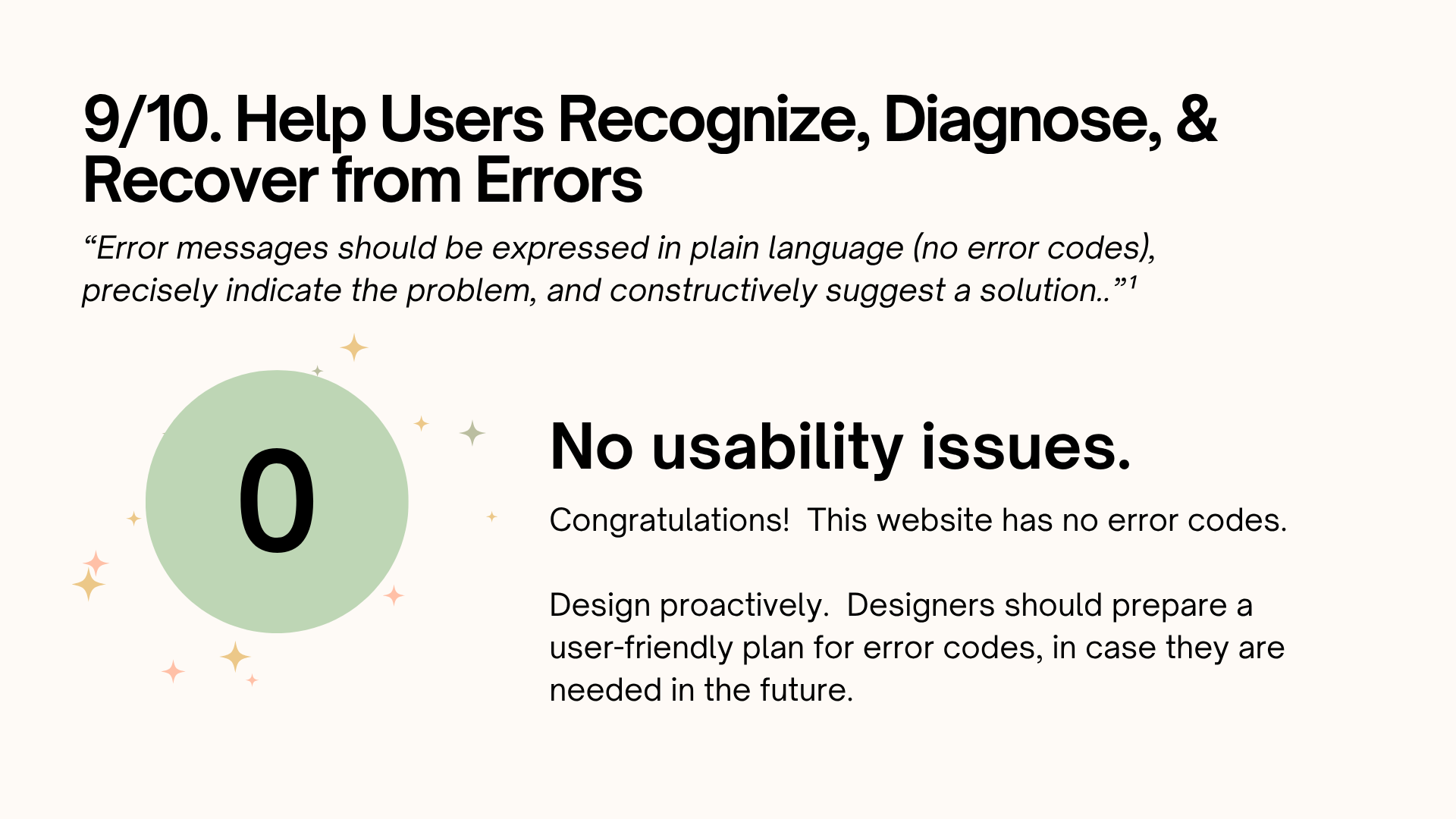
Usability Testing
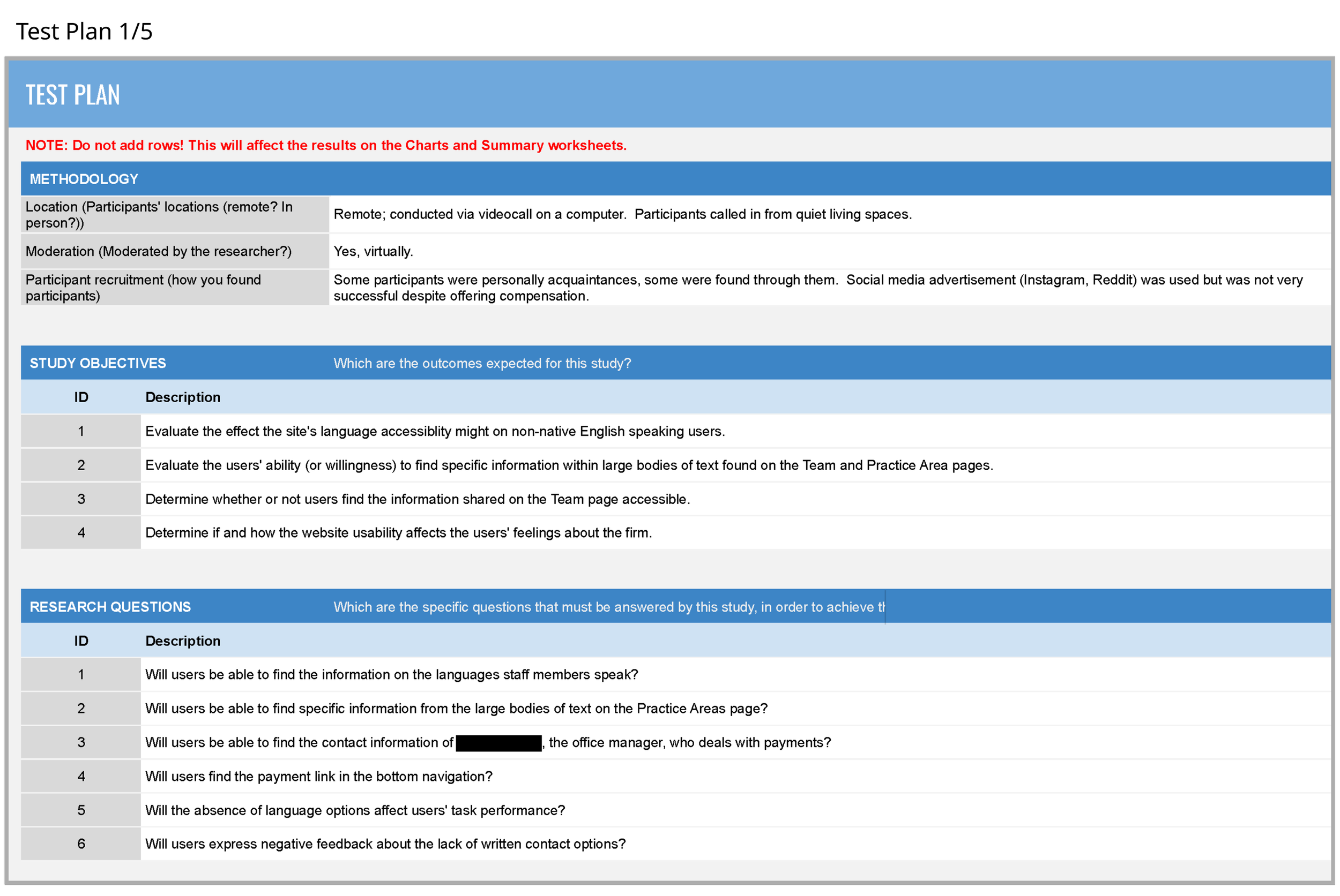
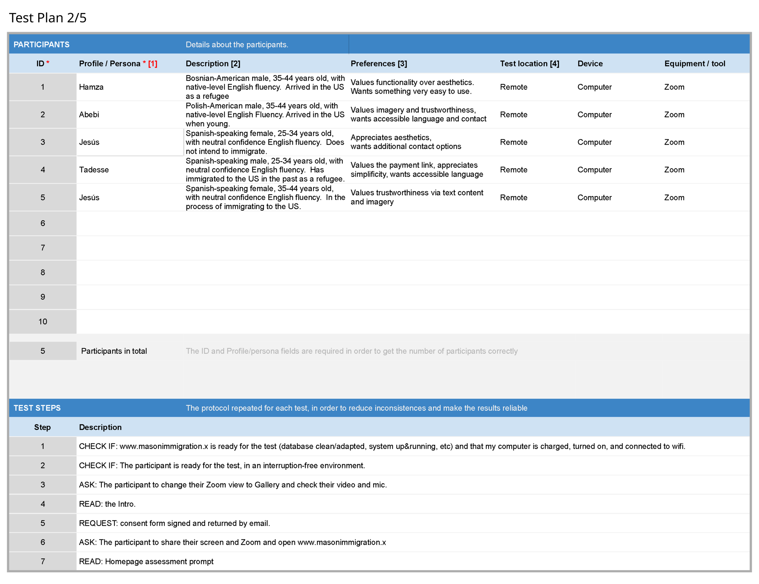
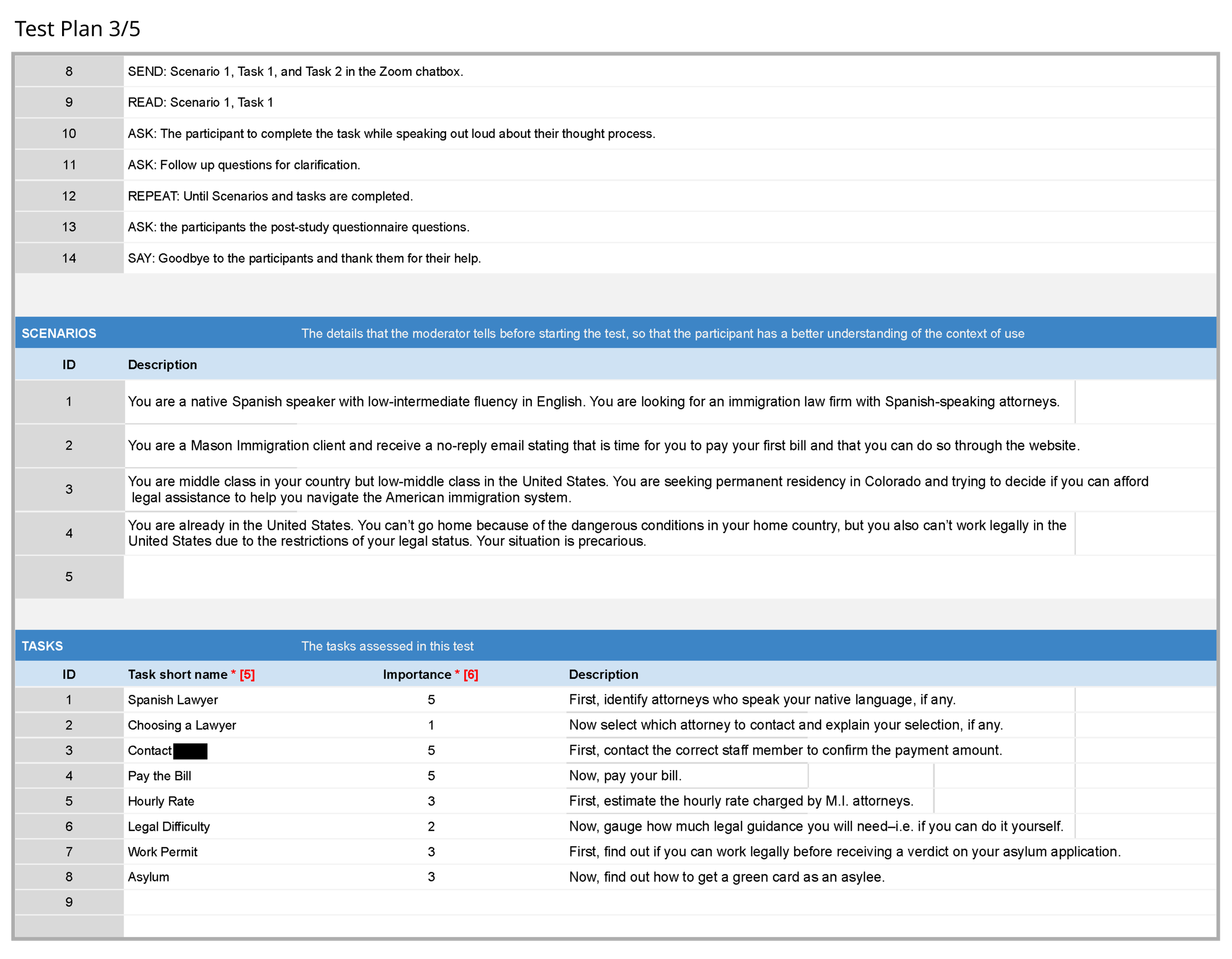
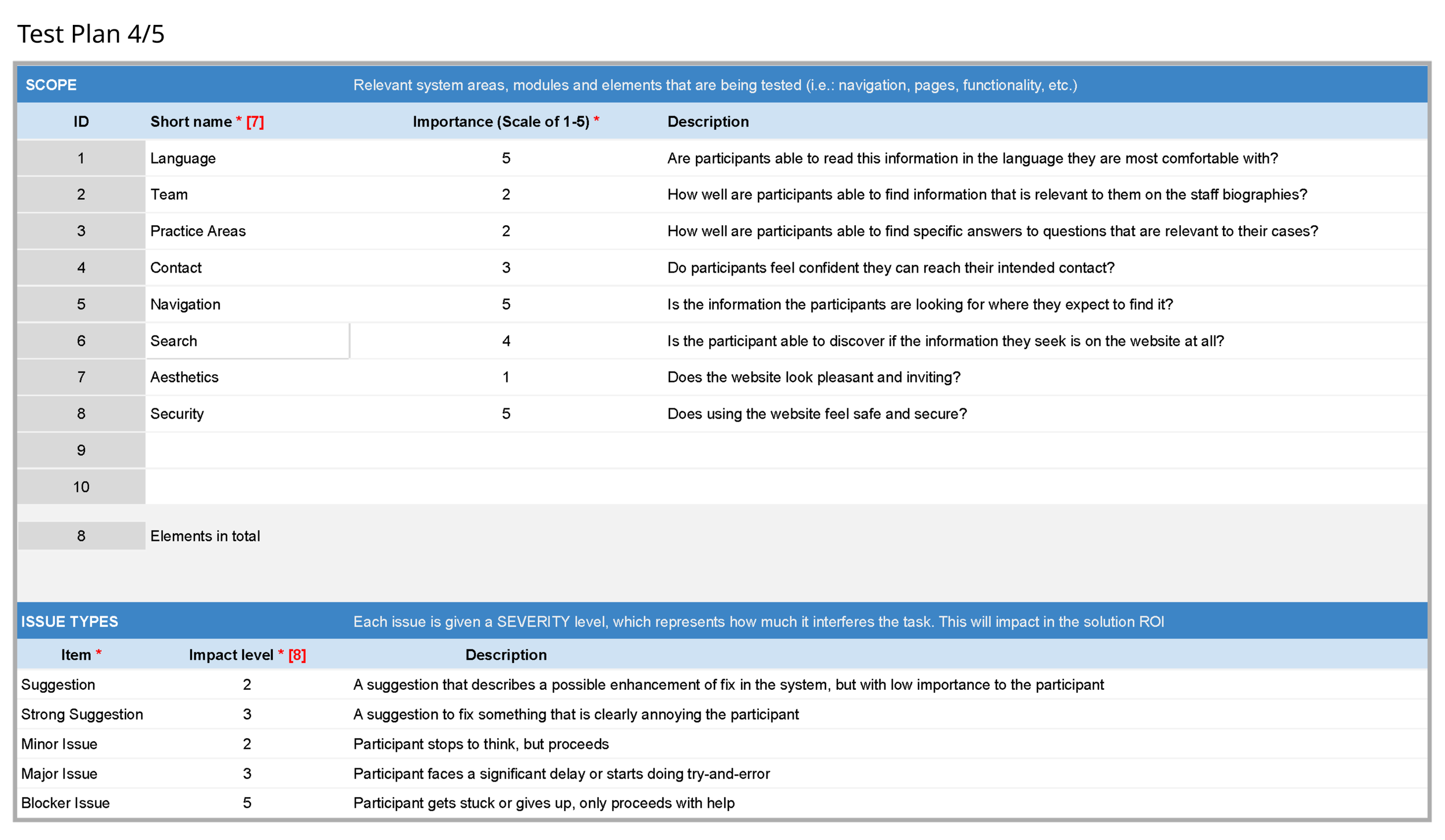
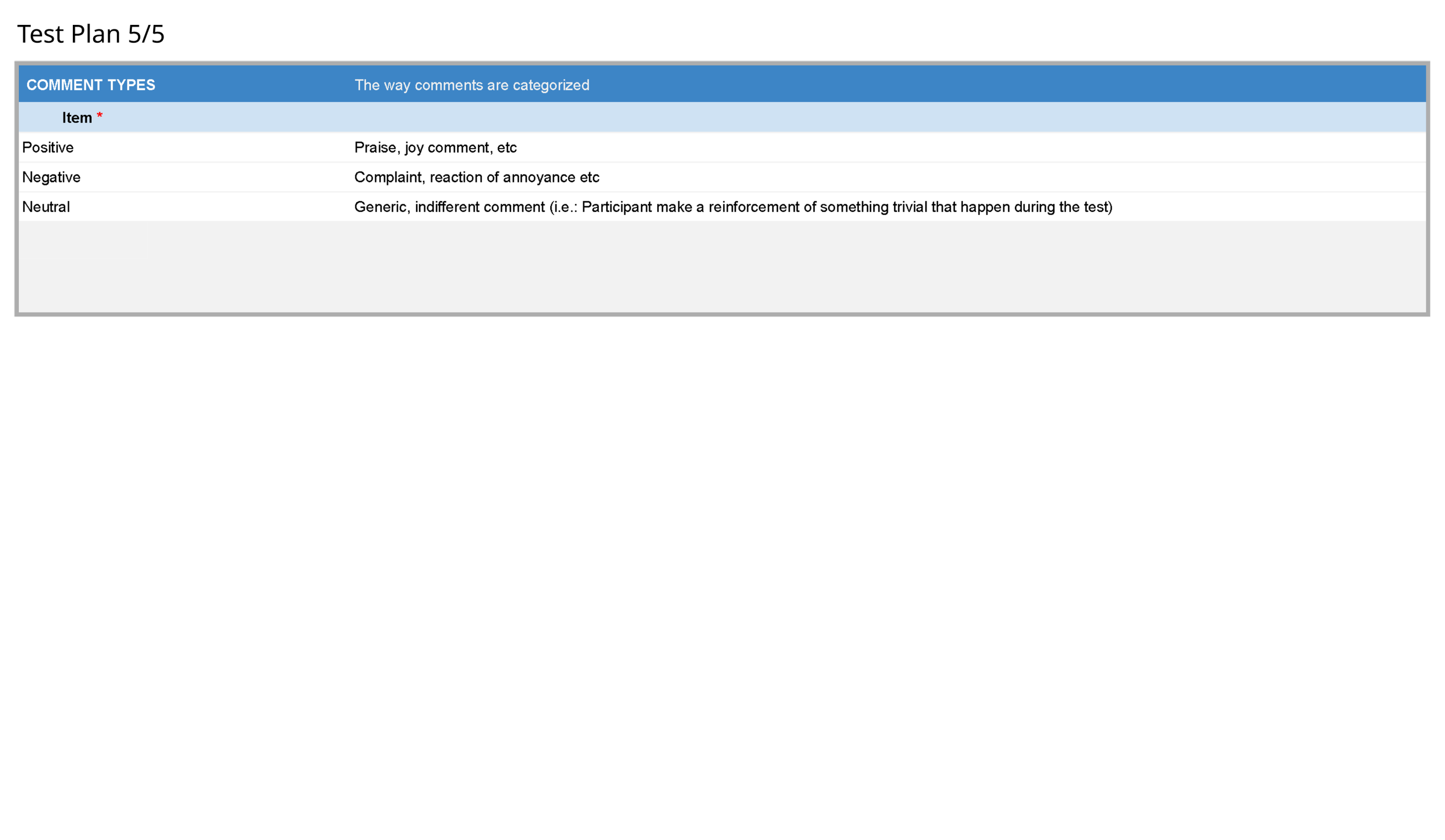
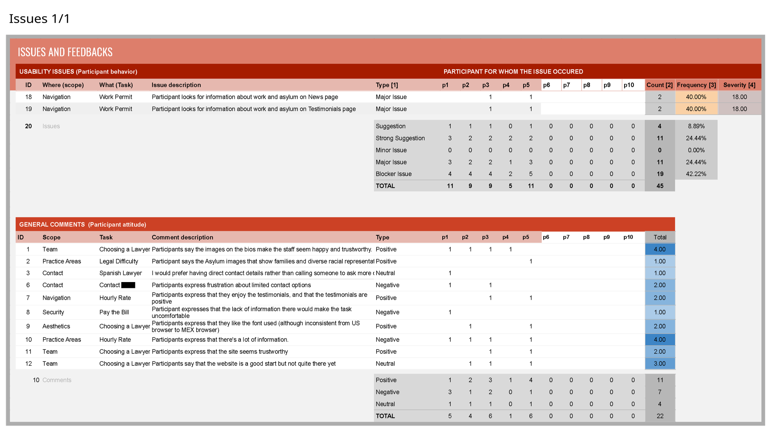
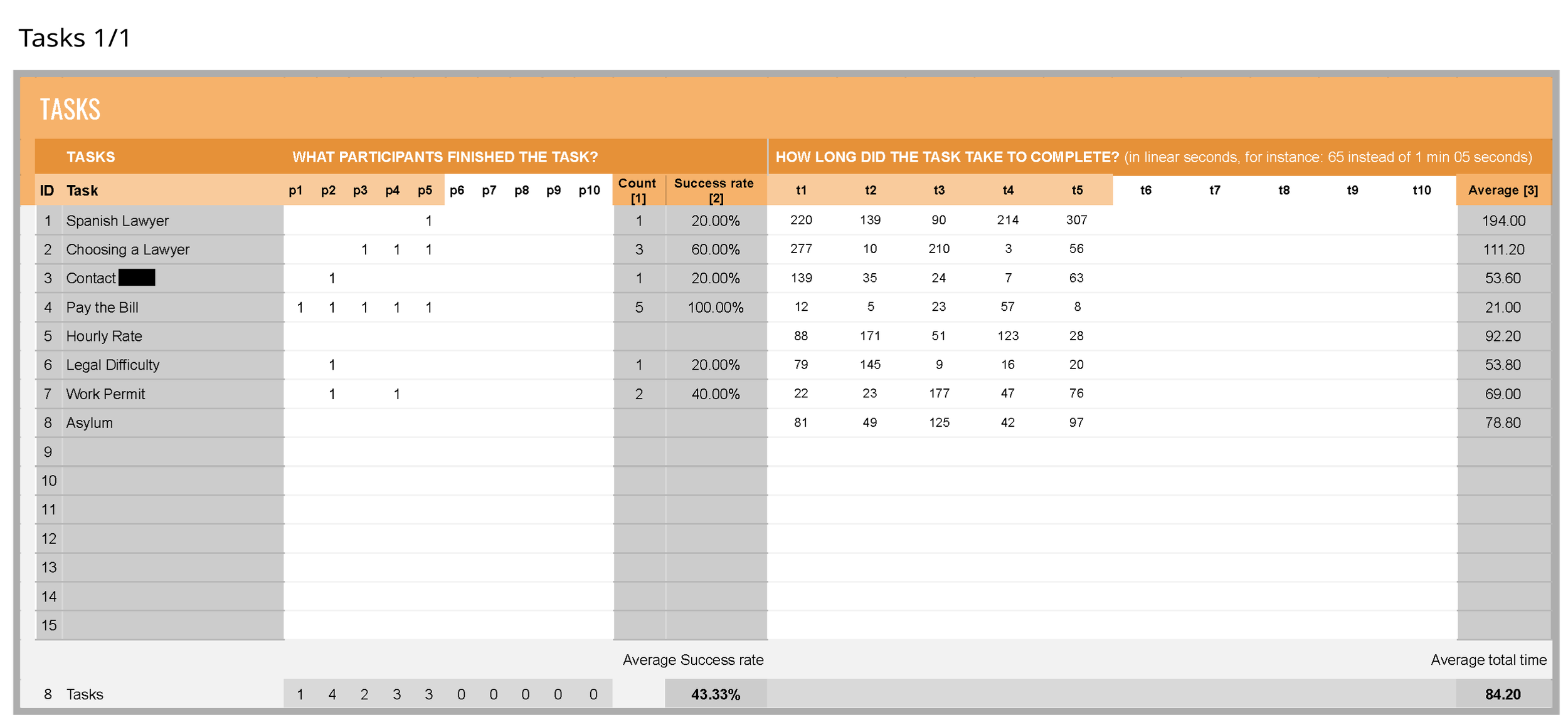
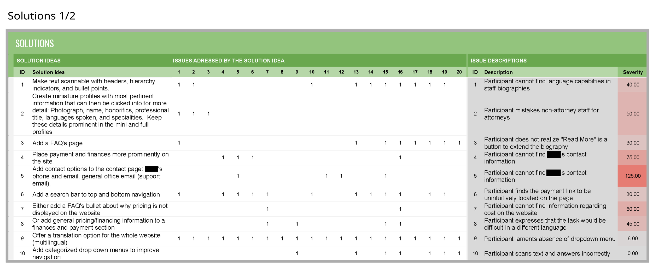
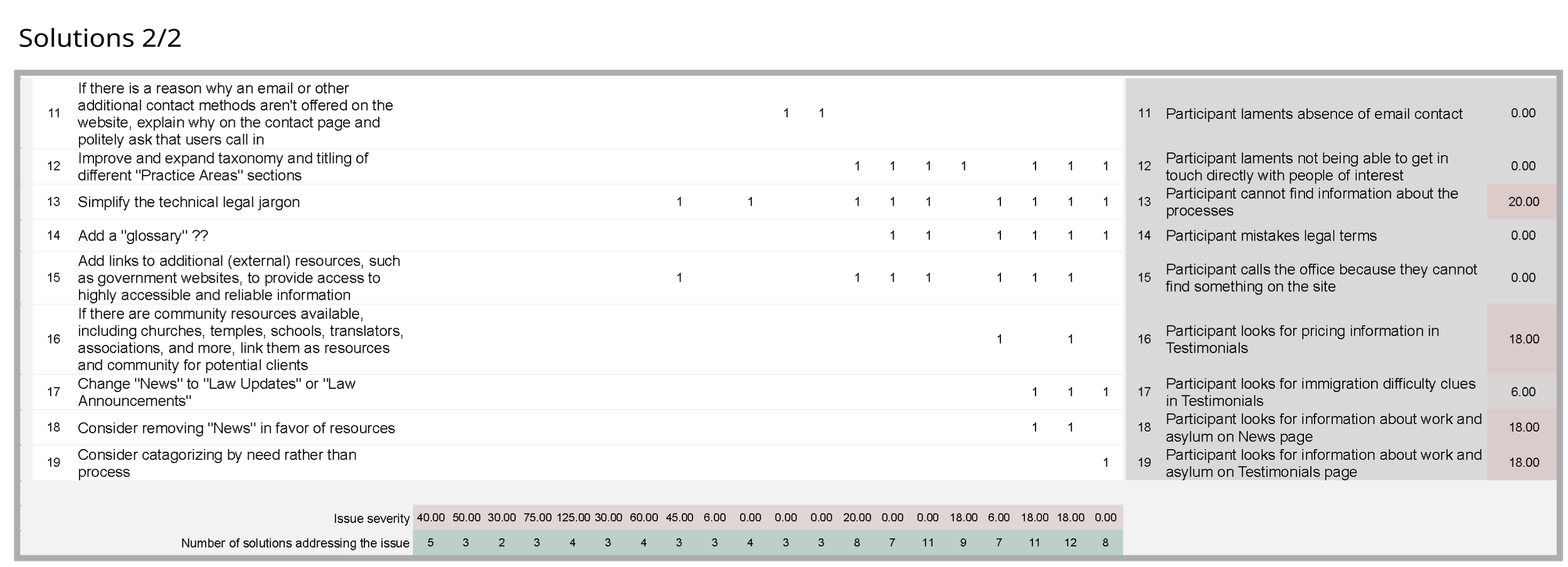
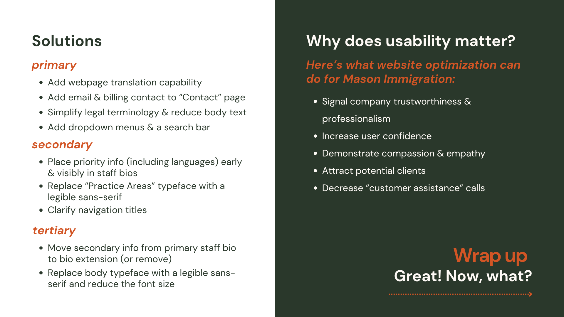
Usability testing helps UX professionals determine what’s working well for users and where improvements can be made. I used a tool by Carlos Rosemberg to analyze usability with five representative users. The scenarios were designed using data from the interview, heuristic evaluation, and surveys.
Personas
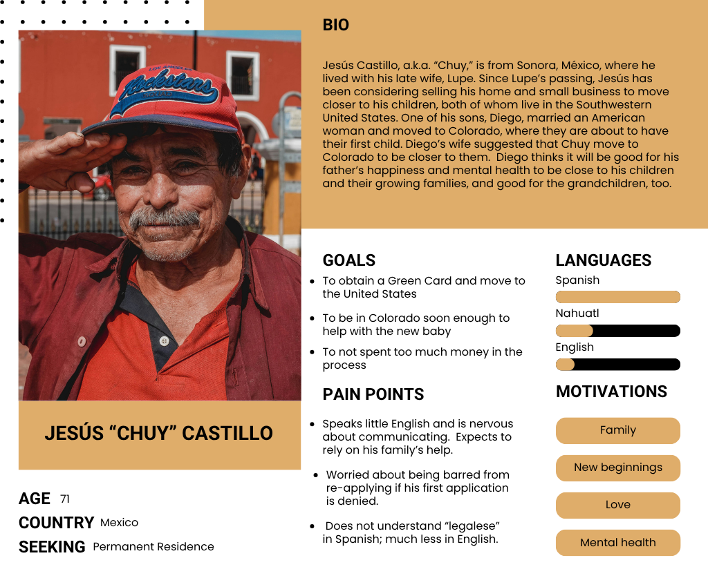
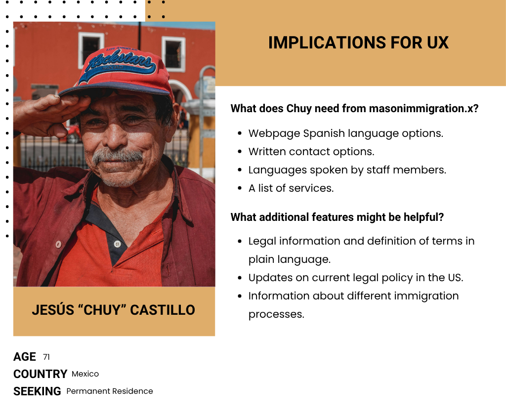
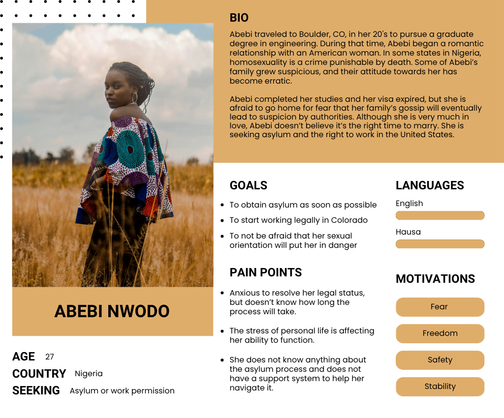
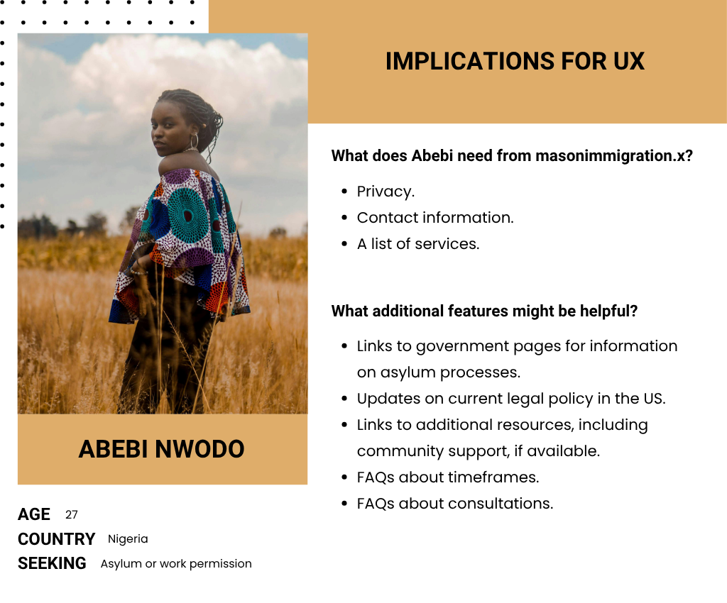
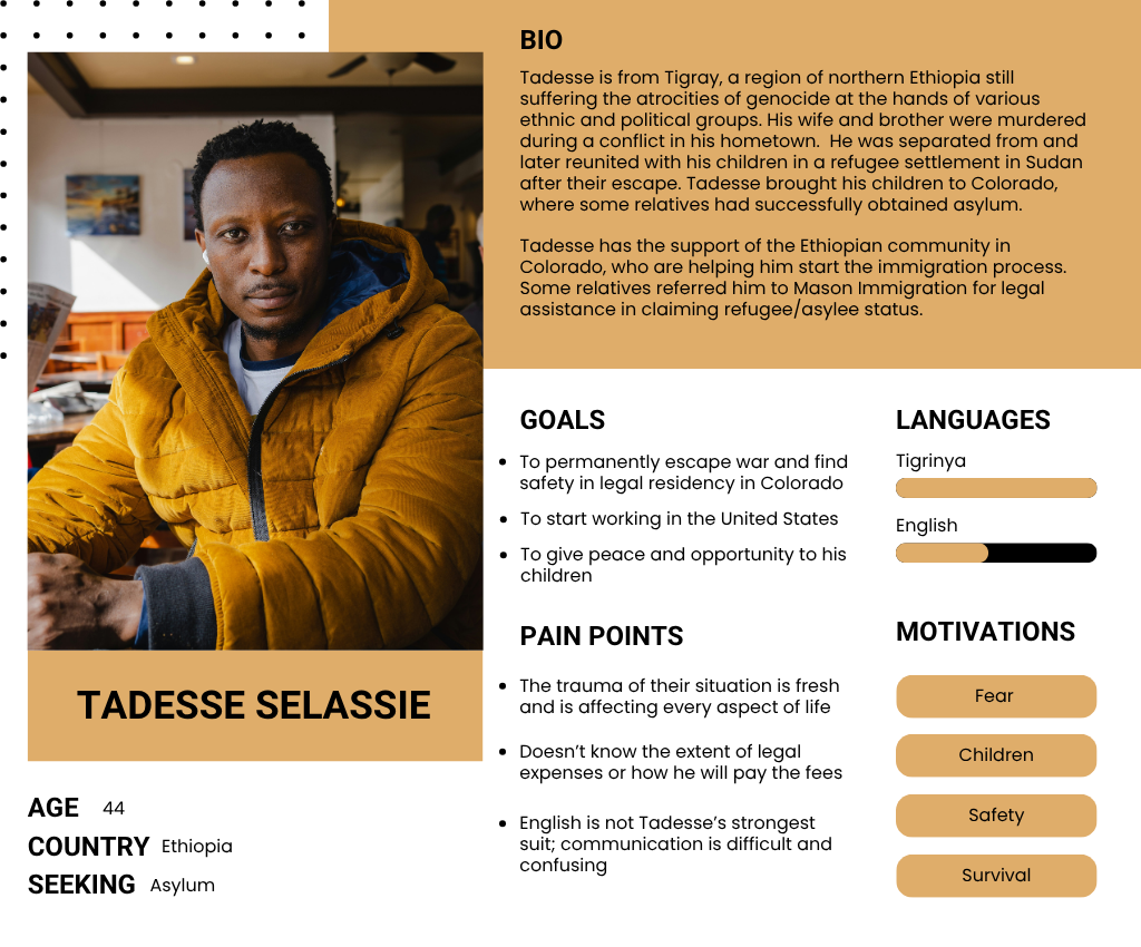
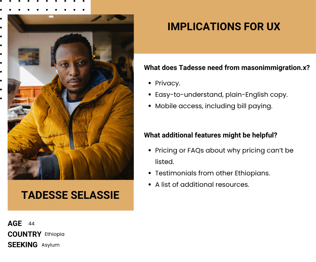
Creating user personas based on research data can help teams align on user profiles and design goals. They work to humanize the user, work as an anchor point for the design team, guide user journey maps, and help brainstorming processes.
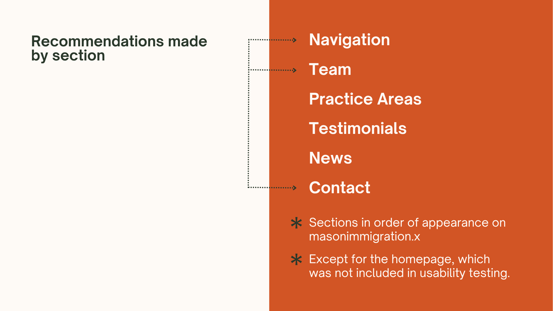
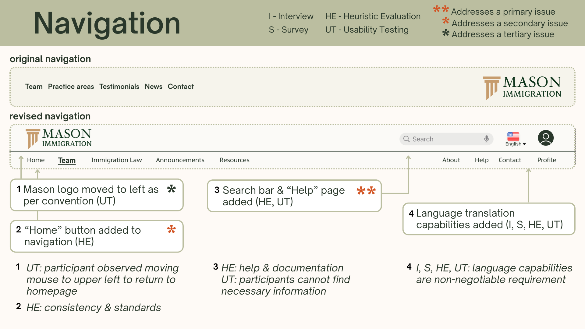
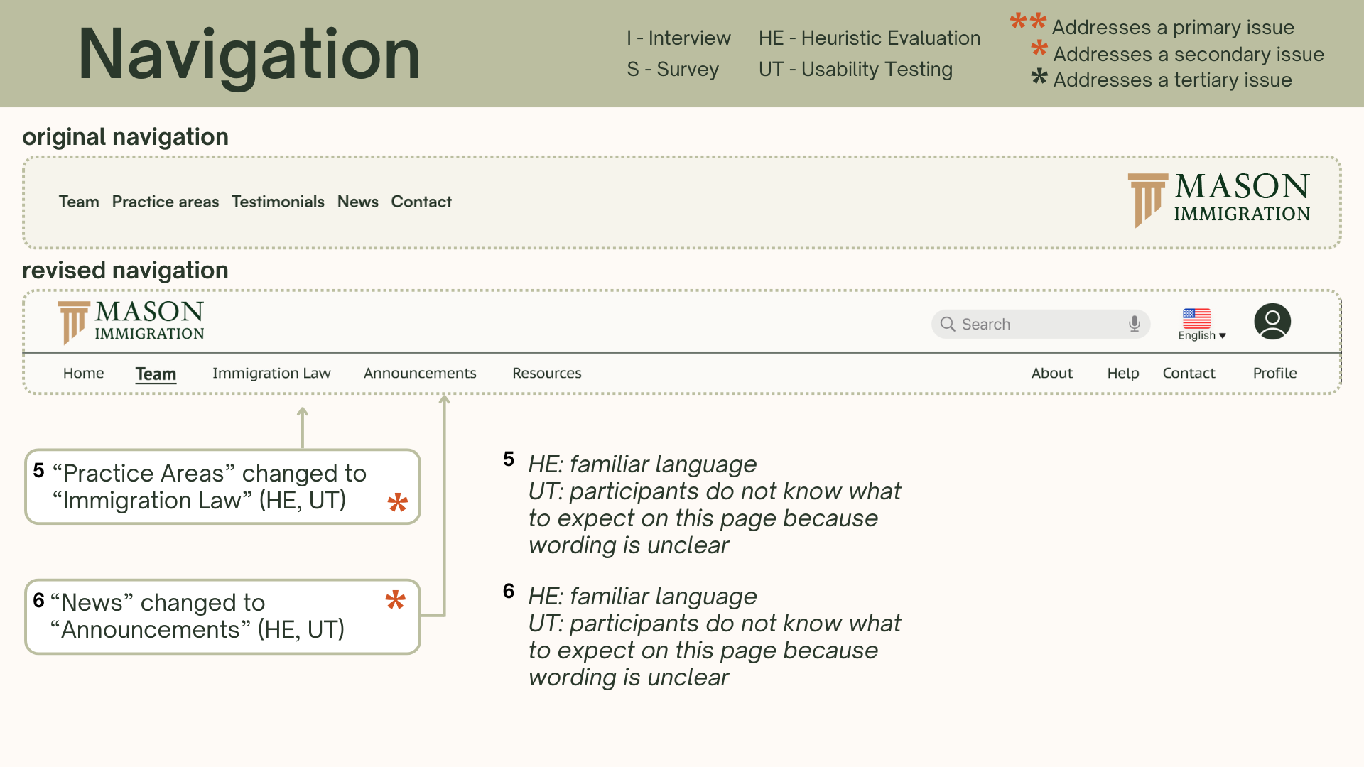
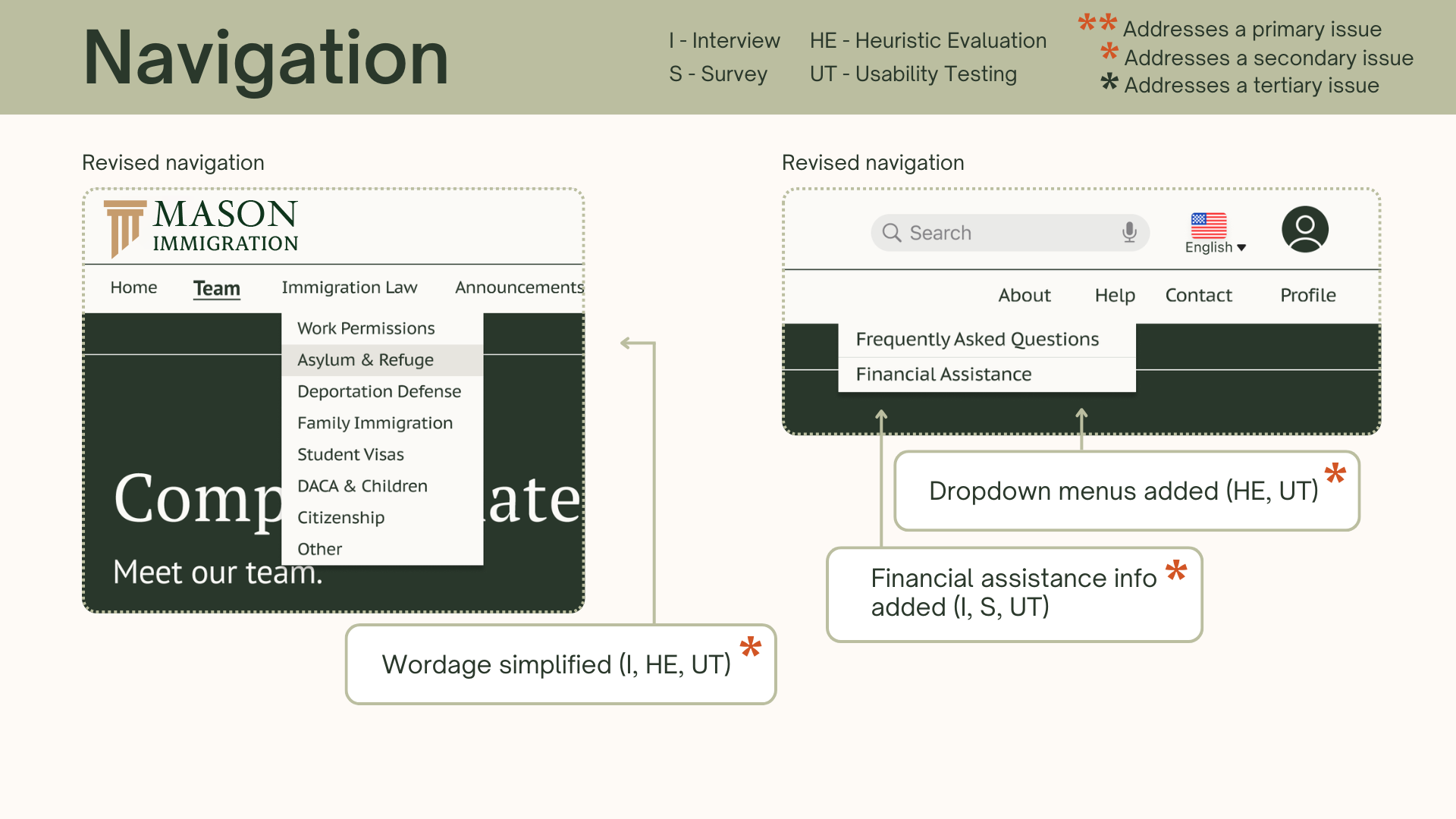
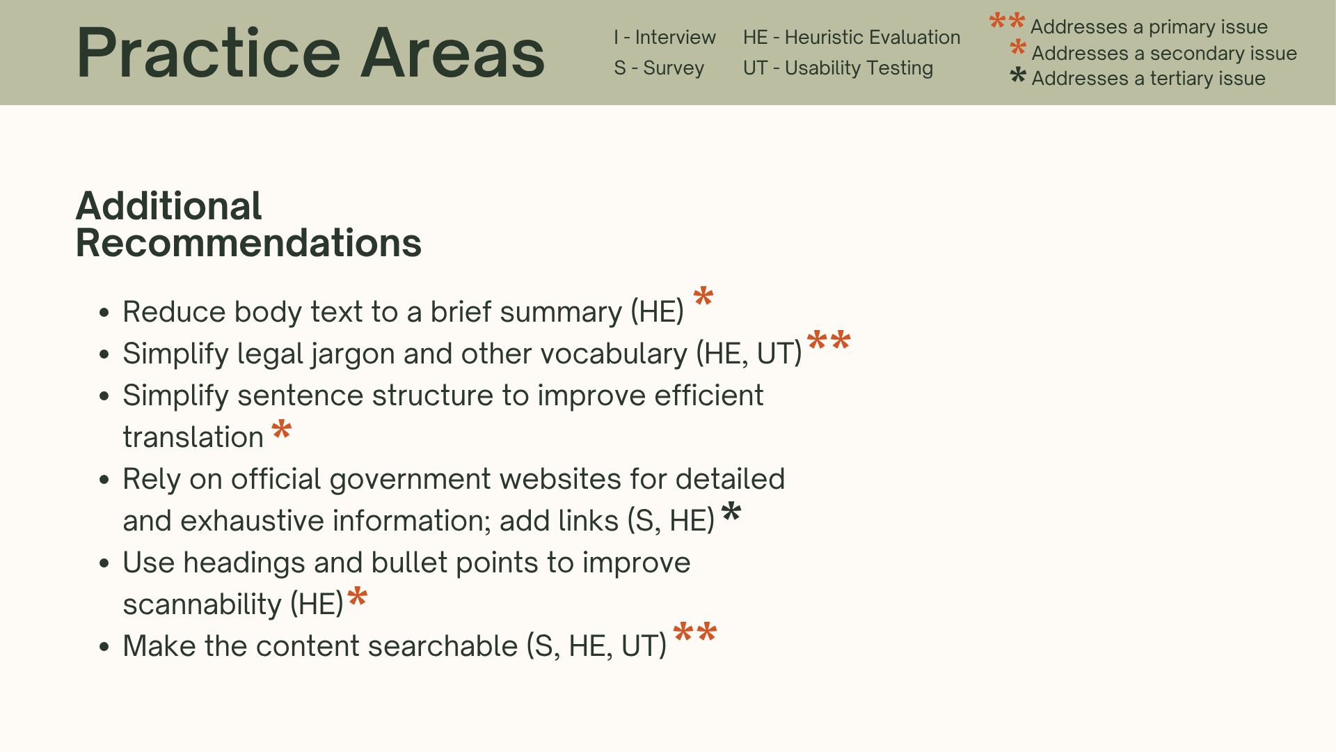
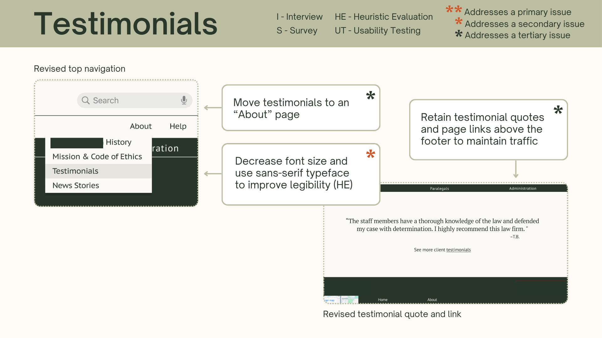
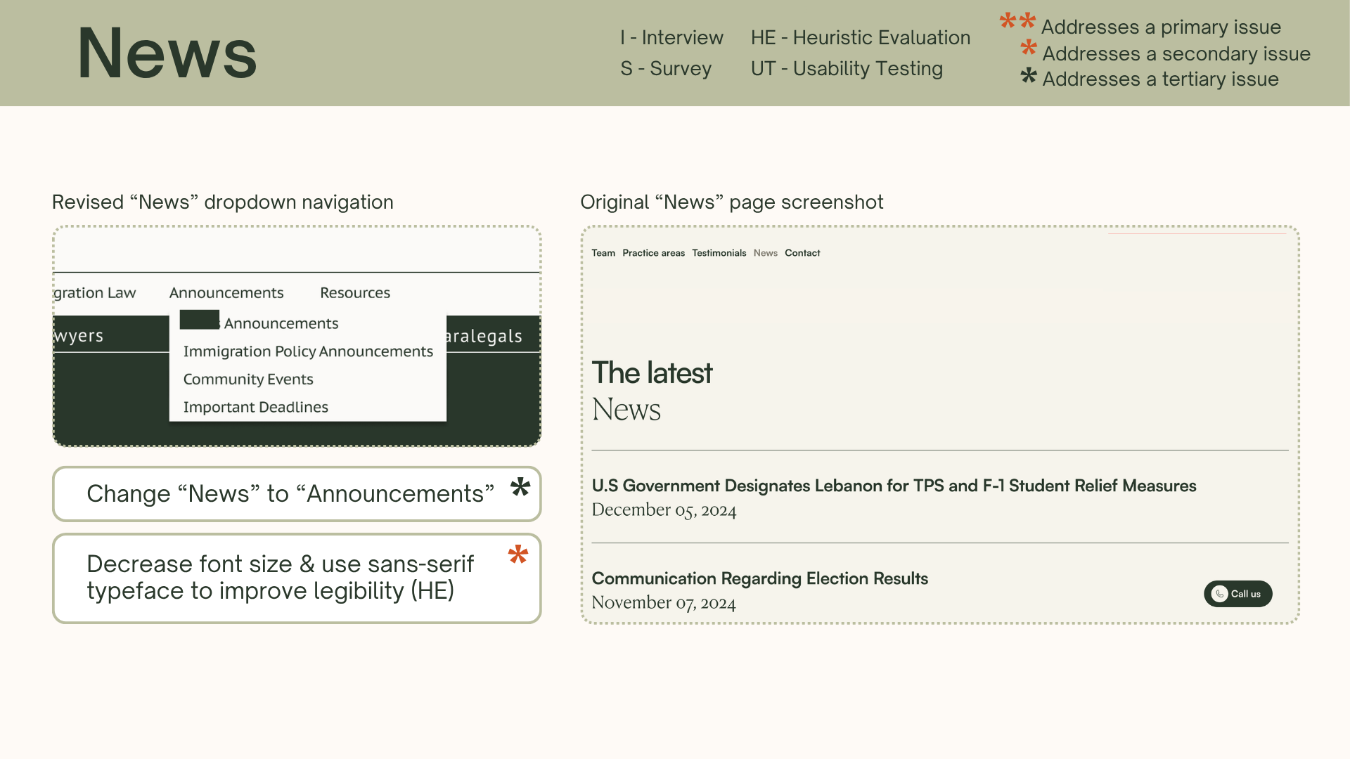
Usability Recommendations
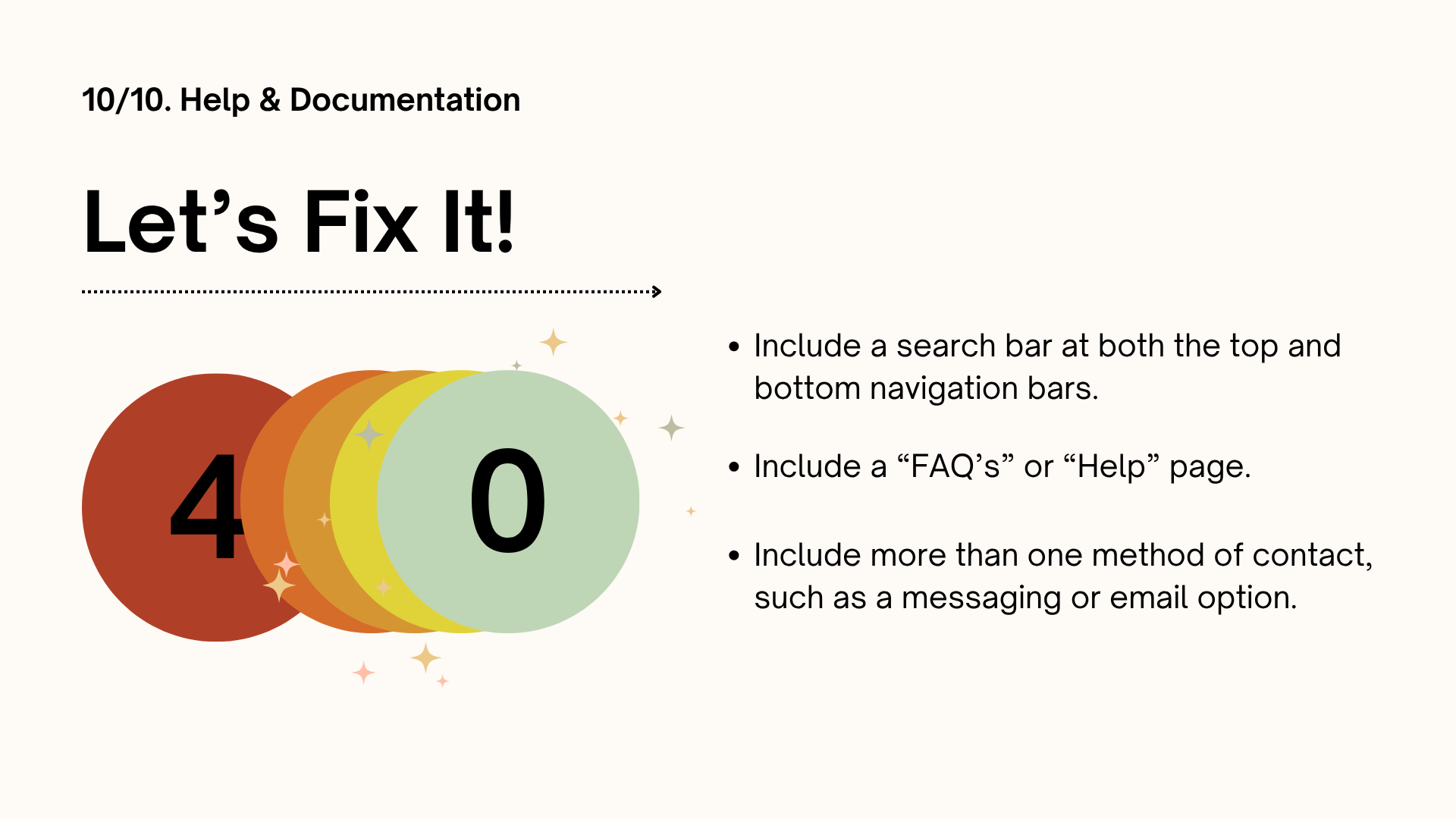
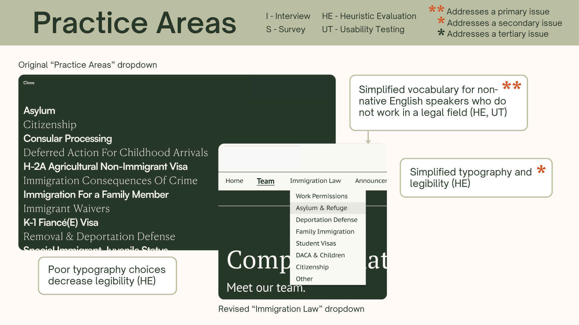
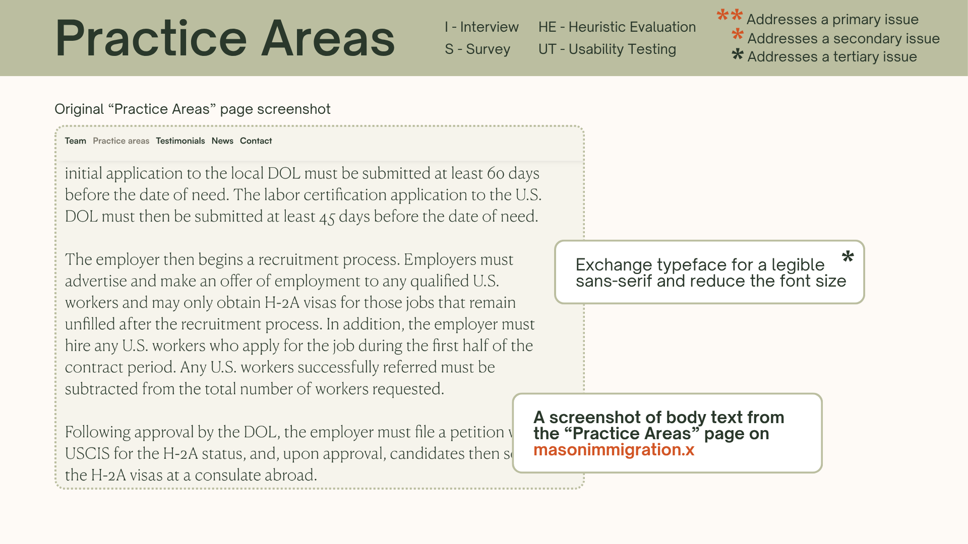
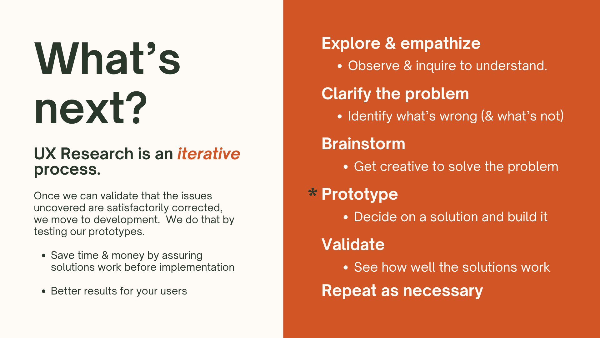
Proposed design changes based on usability principles and research data.

Design Process
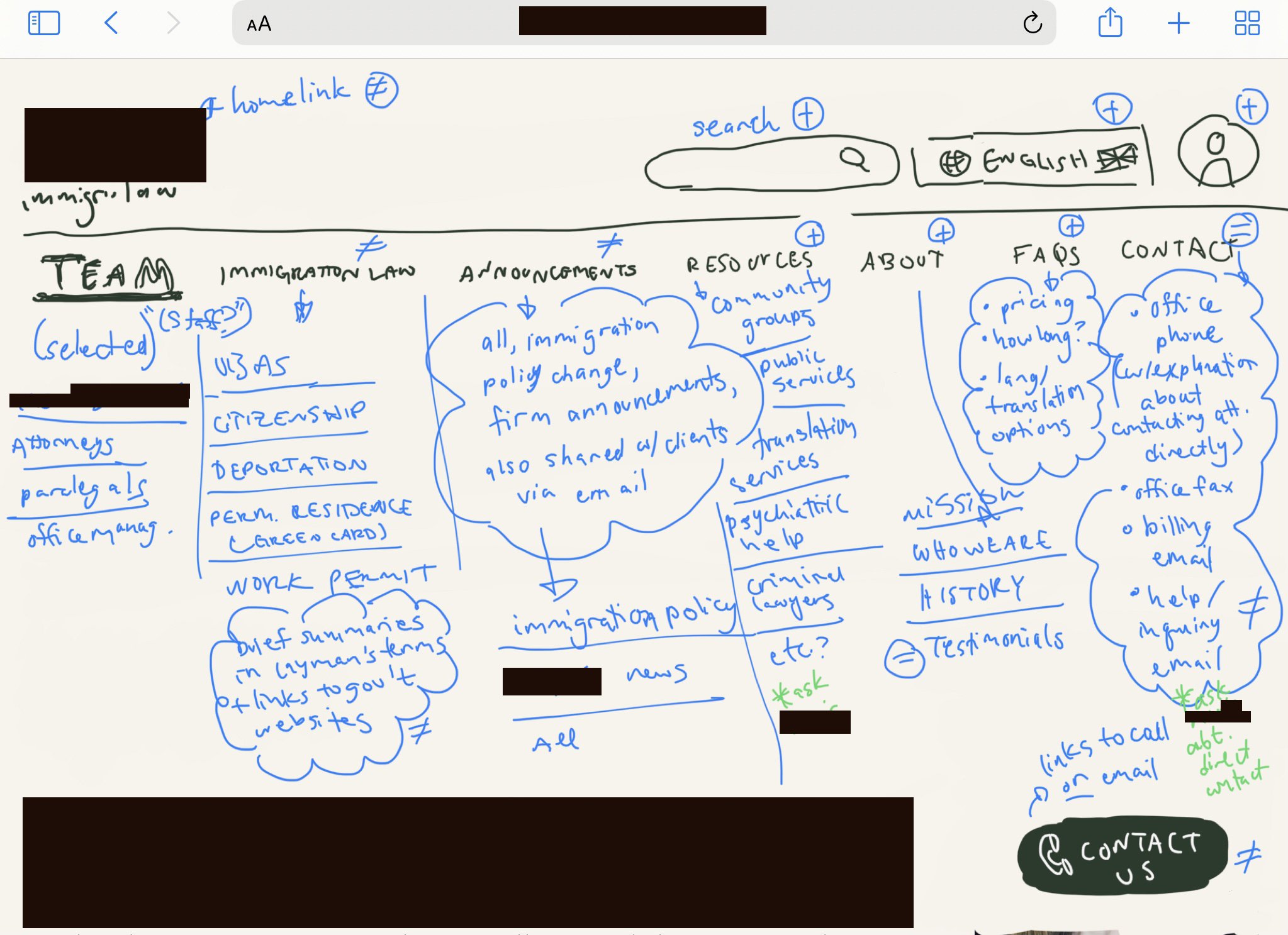
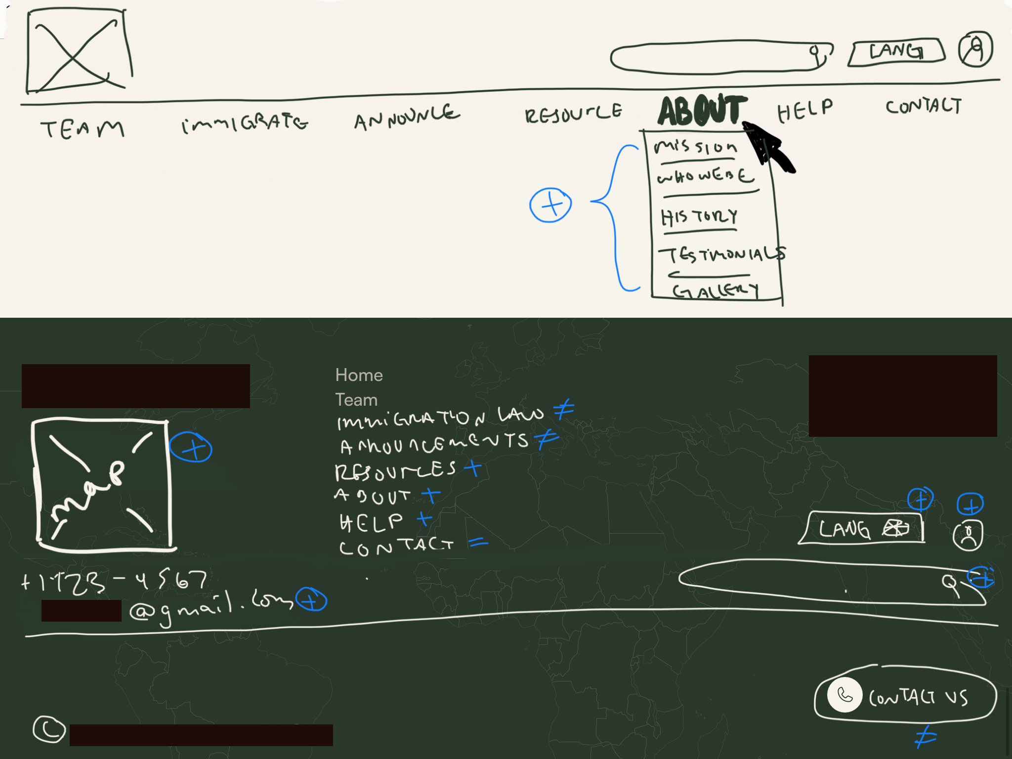
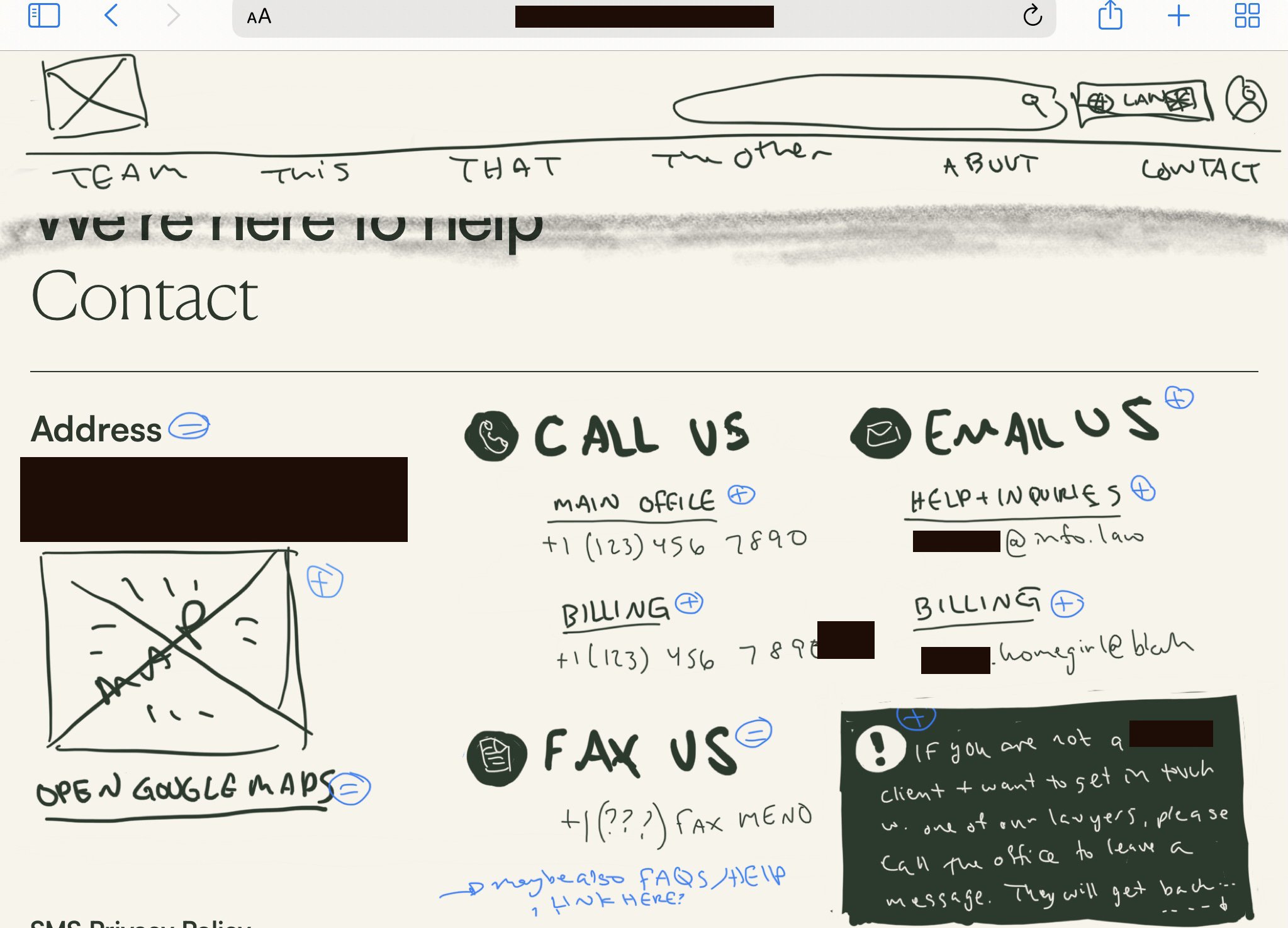
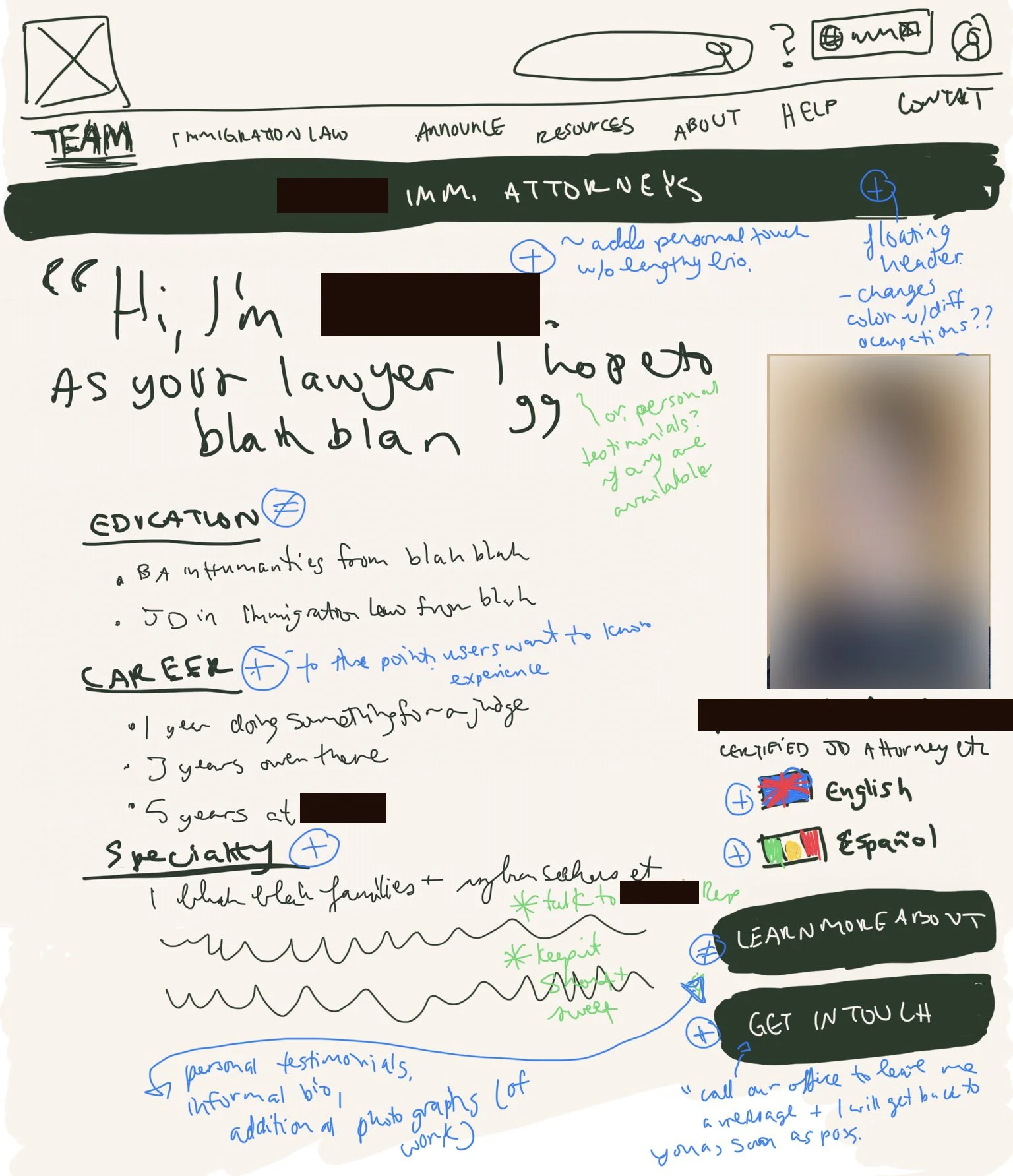
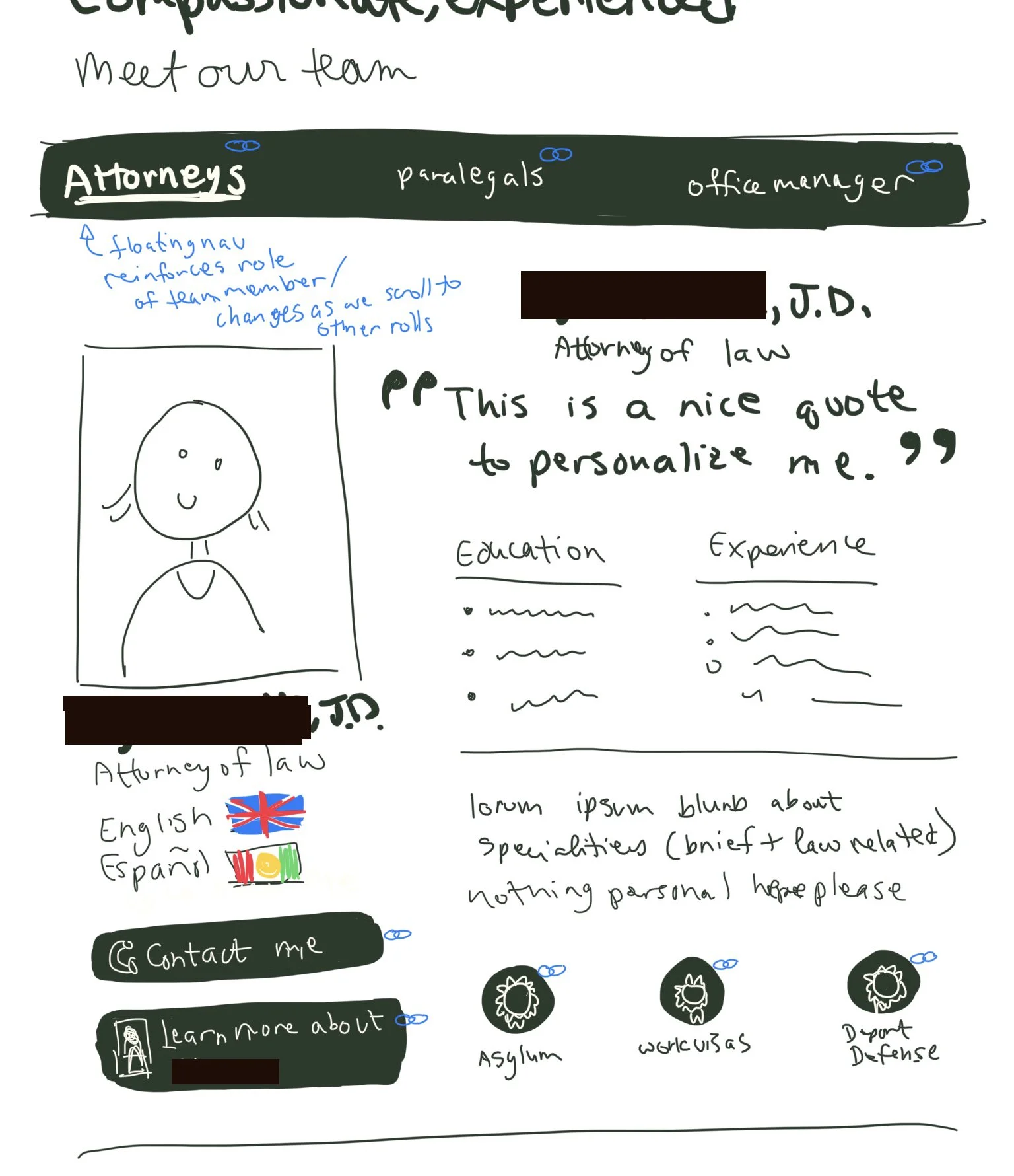
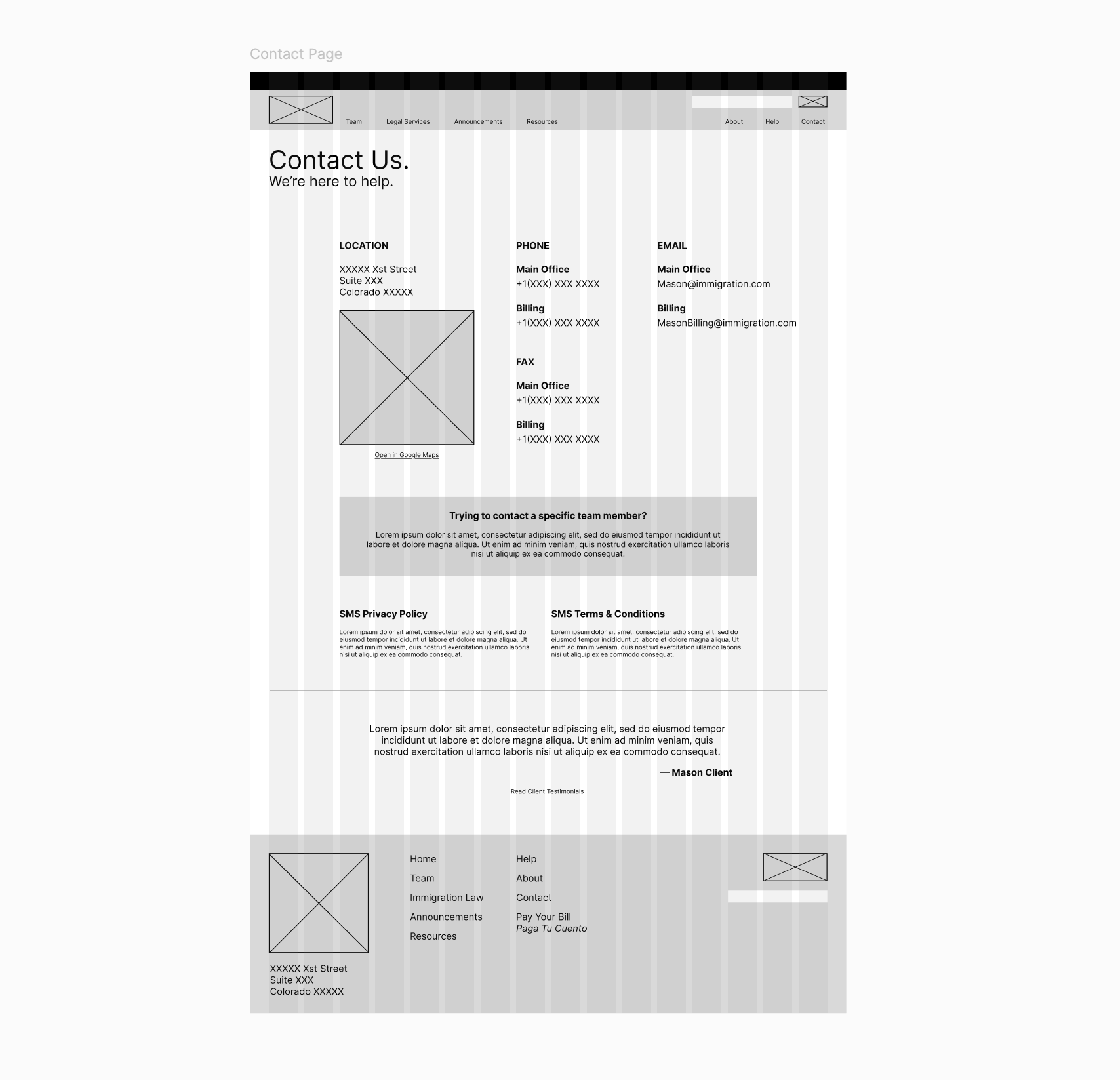
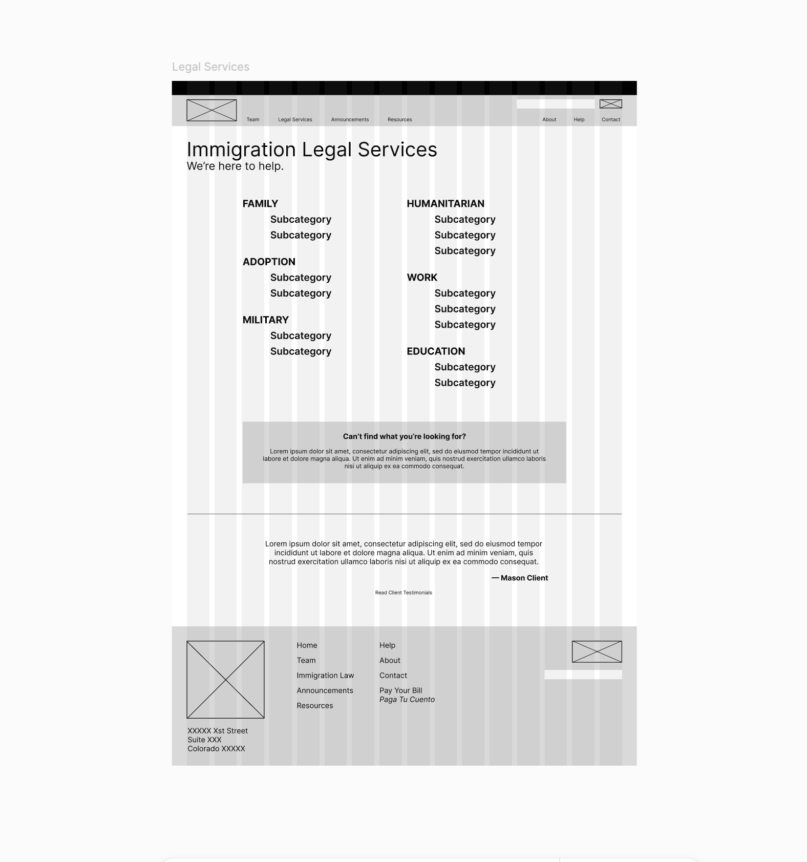
The redesigned pages are simple constructions and did not need many iterations or serious restructuring to arrive at significant, functional improvements. Stages for the visual design process were initial brainstorm sketching, and digital wireframes and clickable high-fidelity prototypes created in Figma.
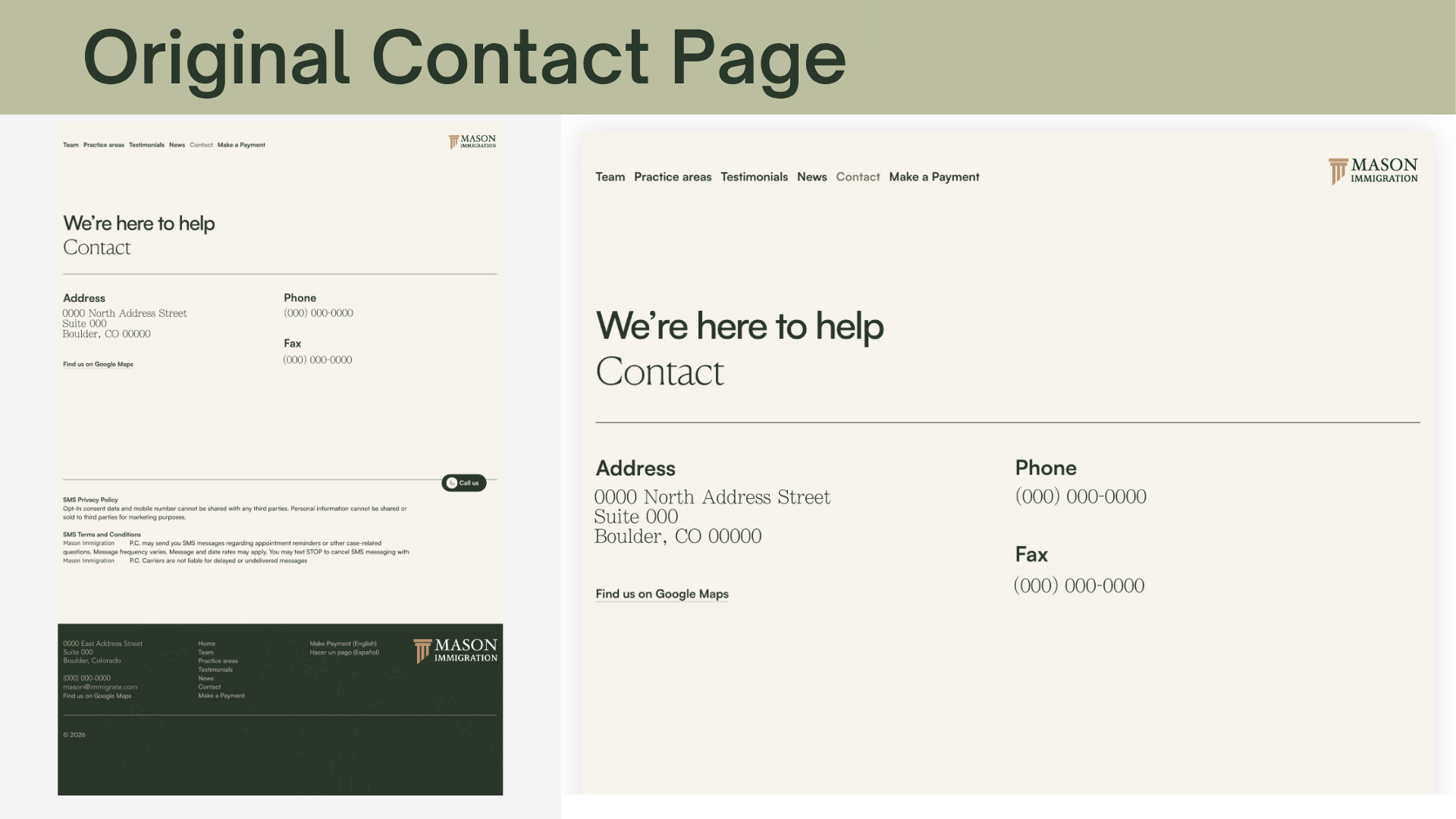
Contact Page
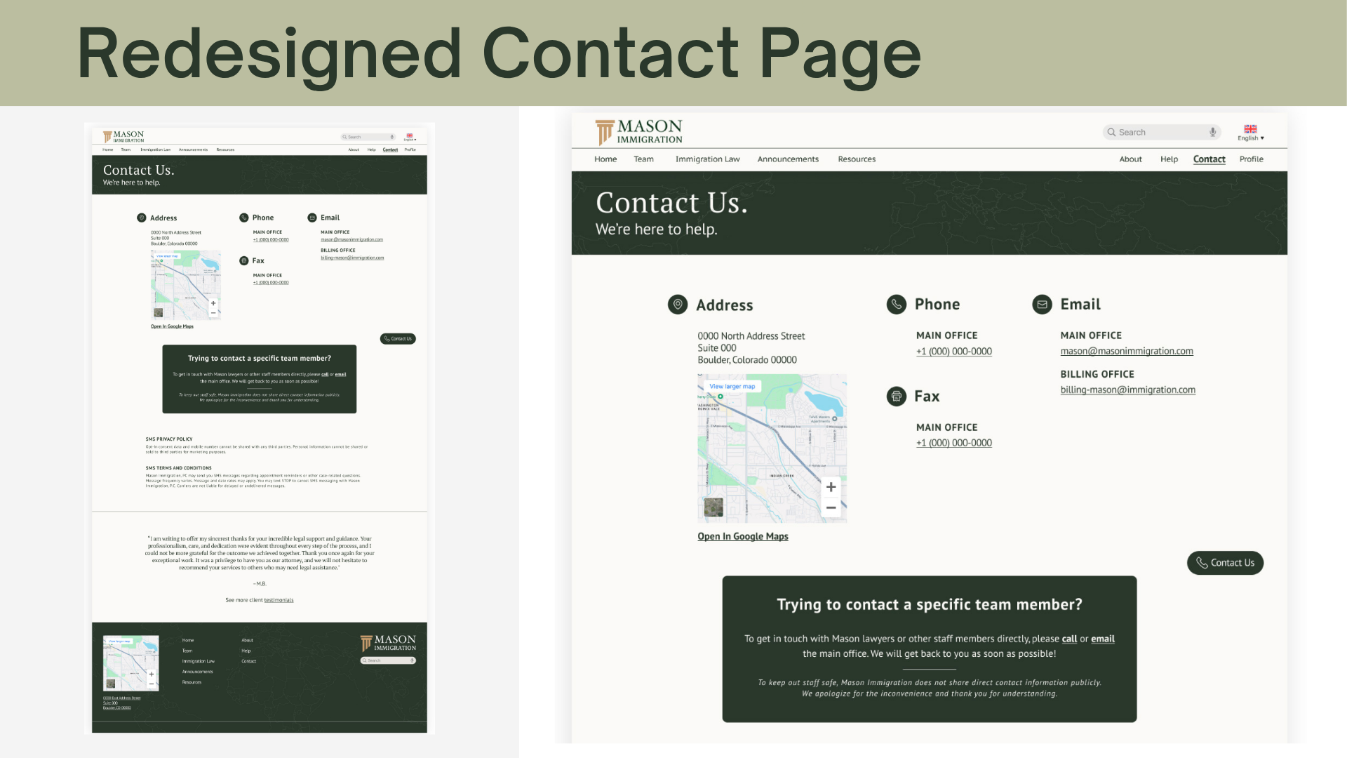
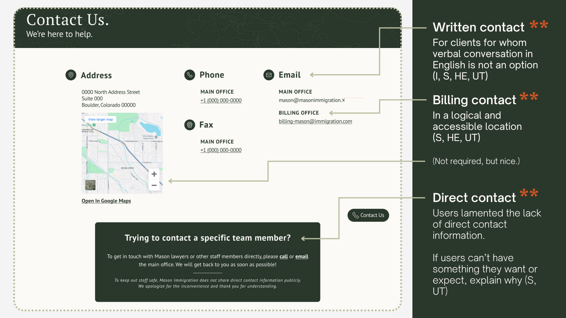
The Contact Page is the most important page on the site. An email contact option was added to accommodate users that were not comfortable speaking on the phone, as was Billing Office contact information, an embedded map linking to a GPS application to support off-screen goals, and an explanation regarding the absence of individual staff member contacts.
Team Page
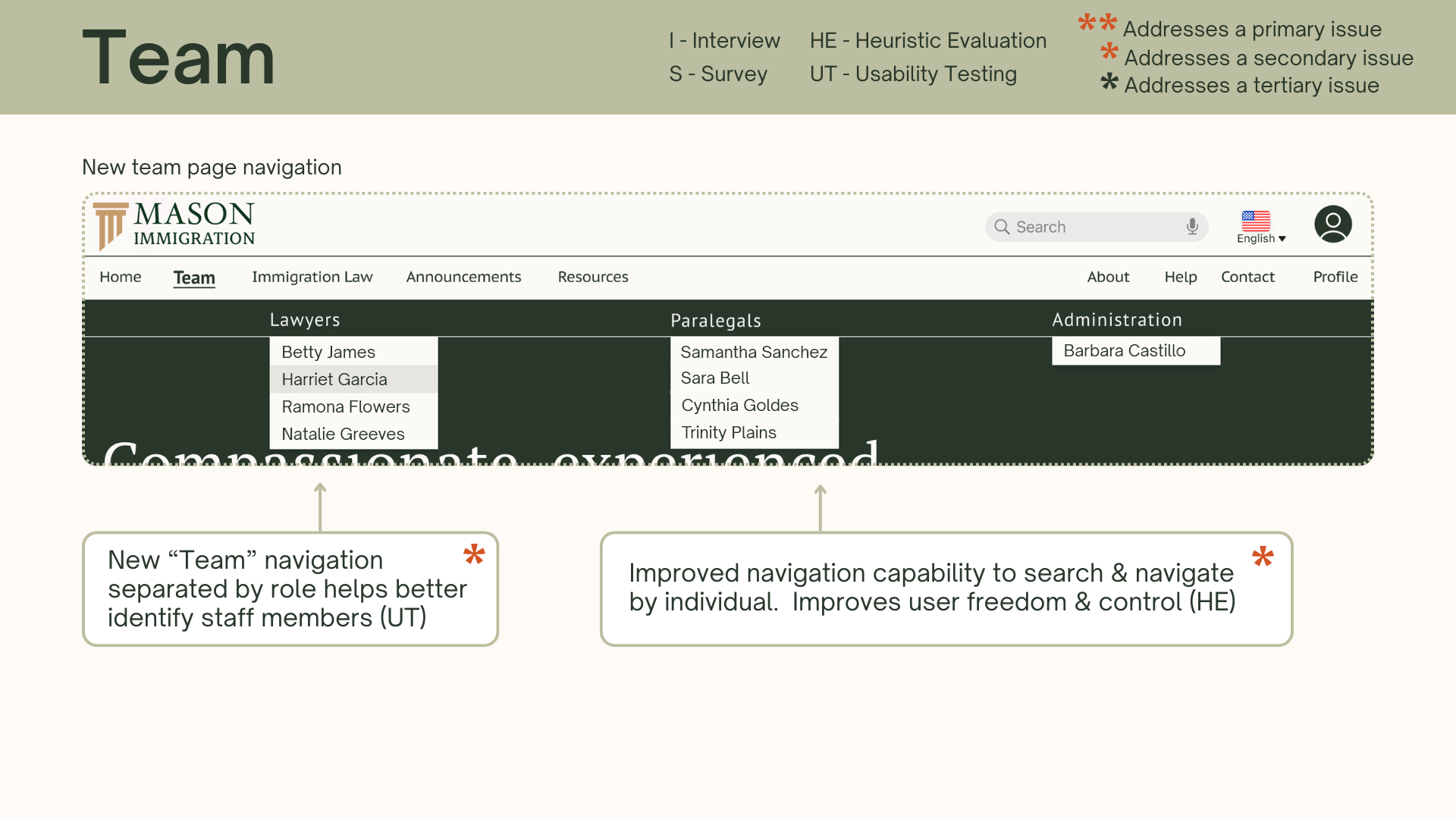
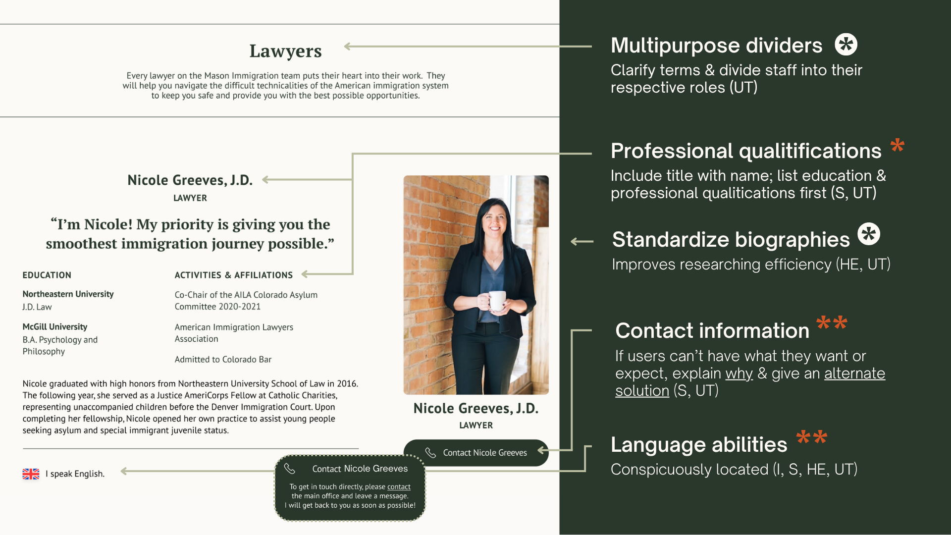
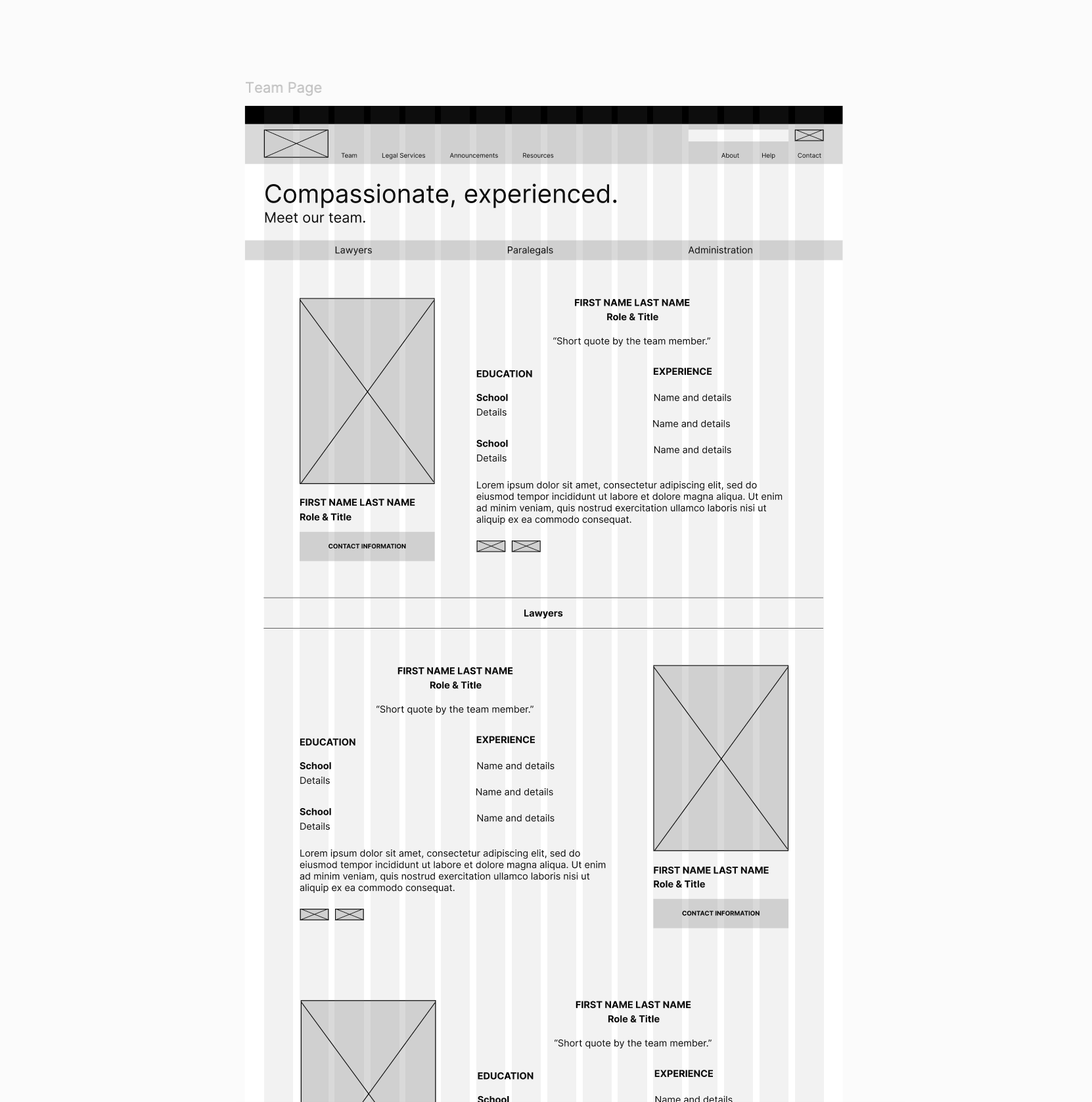
The Team Page is where Mason Immigration attorneys make their first impressions on potential clients. Surveys, usability testing, and the heuristic evaluation on the original design all revealed significant problems with information dissemination. The redesign prioritizes important information and improves scannability with reduced body text, consistent formatting, and visual hierarchy.
A Reflection.
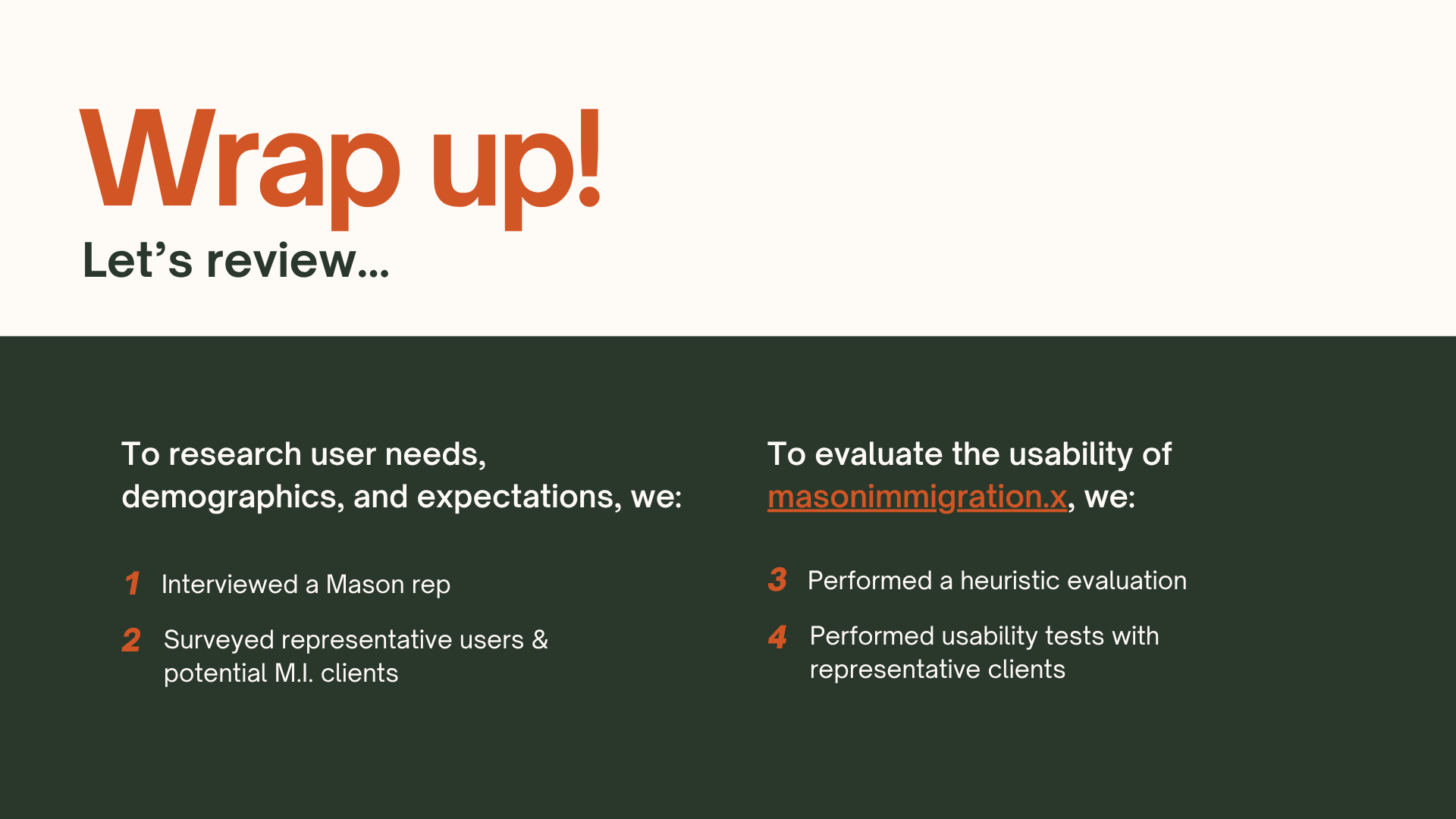
Like I mentioned in the introduction, I completed this project as part of my master’s program. It was used, in part, to practice different research methods. If I were to repeat this project outside the academic context, I would, for practical reasons, spend less time on research. As a UX professional, this is a controversial opinion. Most of us have to beg the companies we work for to invest in research — a stance I agree is usually merited.
This project is an exception. Mason Immigration Law Firm is a small business, and their website is almost exclusively informational. They regularly provide legal services pro-bono. While I have not asked the business owner herself, I suspect she and most of the staff would prefer to continue providing pro-bono services to clients that need them, rather than spending company funds on UX research beyond what is necessary for such a simple platform. Were I to consult with the owner on how to make the most of the audit and redesign, I would have suggested the following:
General Research (Discovery)
Interview
Heuristic Evaluation
Survey (optional)
The survey could have been distributed by Mason Immigration to their clients, adding the benefit of real client feedback rather than representative users while protecting their privacy.
Much like the survey I used, it would have focused on identifying user expectations and exploring opportunities for additional assistance. Including links to relevant government pages, community organizations, and translators and notaries in a resources page, for example, was a great way to add value to the website at a low cost to the firm.
In the perfect world
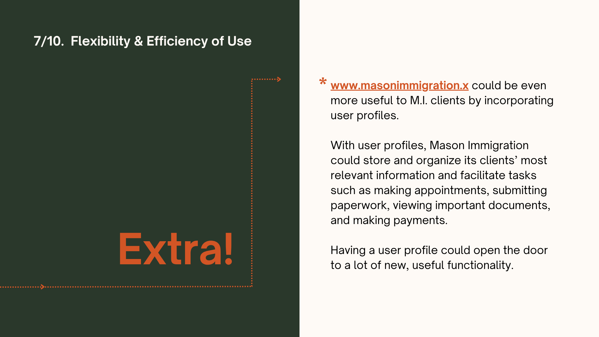
In the imaginary world of unlimited funds, I would have loved to create client profile pages, where clients could communicate with attorneys, paralegals, and administrative staff; receive, store, and submit important documents; view invoices and pay bills; keep track of important court dates; and make appointments. Such functionality would have merited more robust research, including usability testing.